Learning Management System (LMS)
Educational Interface platform at major Universities.
Structure for online courses, in-person course information distribution, and student-professor communication.
Product Designer (student case study)
Graphic elements re-creation
Research, Interviews, Prototype, Usability Testing, UI Design
Figma, Adobe: Illustrator, Photoshop
Project Duration: 15 weeks
Role
Canvas is a Learning Management System utilized by universities for online and in-person courses. The platform provides 'course shells’ that instructors use to disseminate course content, create assignments, track grades, and keep attendance.
Since the COVID-19 pandemic, the platform is now integral to the university course structure. Students are accustomed to using the web-based platform and the app to reference course deadlines, reference most course material, and contact their instructors.
The platform has progressed since March 2020, but limitations remain that inhibit the ease of communication between students and instructors. The addition of a chat feature to the platform increases accessibility, streamlines communication, and replaces the current email-like-based messages.
About
Canvas LMS has a laborious process for all communication in both the app and the web-based platform. Instructors use multiple apps to solve communication and collaboration barriers in Canvas, often turning to Microsoft Teams or Google. These external apps pose security risks and issues with university policies regarding document retention.
A communication experience via mobile or web-based chat is more native to the daily lived experience. This familiarity allows for less formal communication, increasing accessibility for all students and decreasing the excessive time instructors spend on email-like messaging.
Problem
How might we increase & ease communication between professor and student, whilst fostering a less formal interaction?
Process
Competitor LMS Platforms
Reviewed user feedback, common complaints, known issues & limitations, features, usability
User Reviews
Peer insight platforms
Pro/con articles
Canvas user support discussion boards
Visual References
Current Canvas app alerts on the lock screen
Various messaging notifications on the lock screen, reply & expand the sequence
Web-based chat layouts
Research
&
Analysis
How might we add a mobile & Desktop feature whilst considering the security & archival requirements of Universities?
Using multiple devices
Time Constraints
Instructor of 2+ courses per term
Online & in-person courses
1st generation Uni student
4+ courses per term with different instructors
Interviews
&
Personas
Users want easier communication
Students would like an easier form of communication with both instructors and classmates.
Instructors encounter problematic communication with students because of the email-like message structure.
Students and Instructors desire a more interactive, shared workspace.
Inefficient Navigation
Users must sign in each time, then navigate through a course shell to access the messages page.
Instructors and students lack consistency in access to features contained in the web-based vs. mobile platform.
Insights
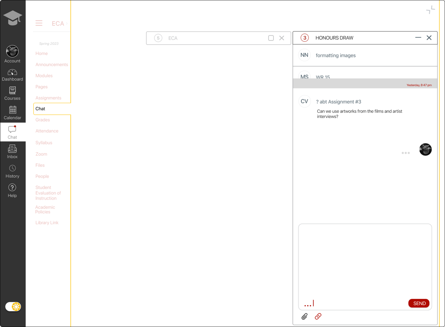
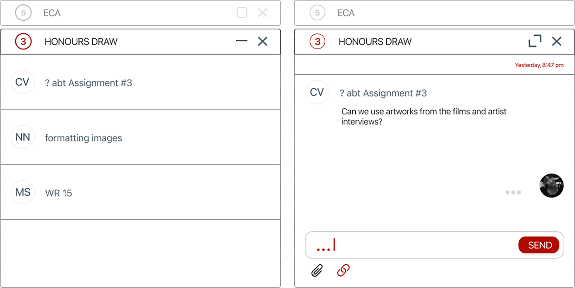
To prevent these pain points Canvas will include a chat option, saving professors time when responding to students, and eliminating the formality and delayed reply of email-style messages. The desktop version will allow for multi-tasking by providing multiple chat window options.
Task/User
Flow
Graphic elements
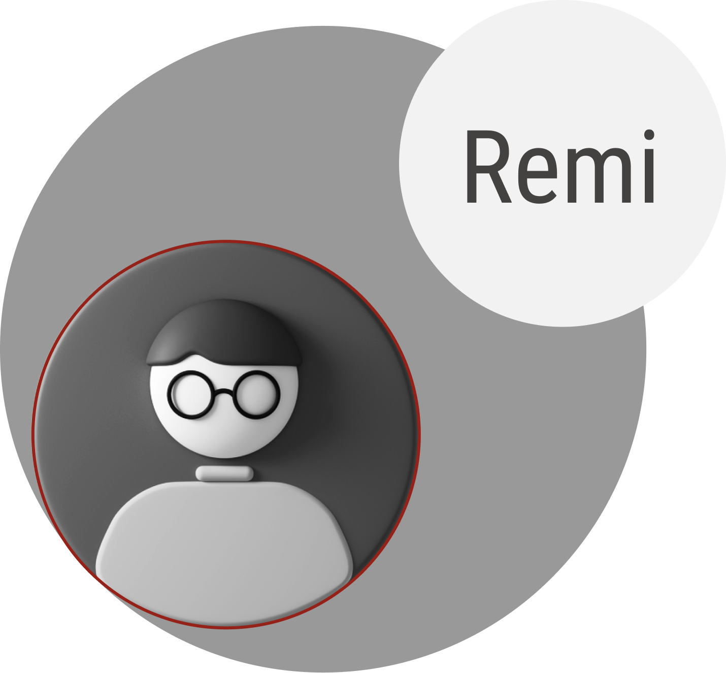
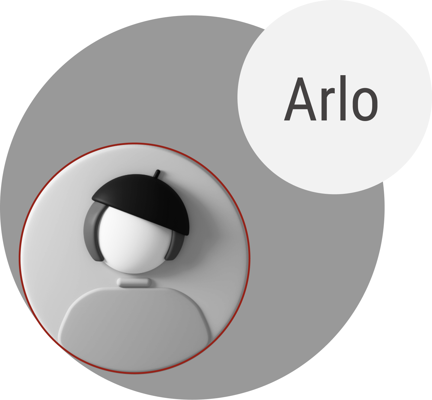
The Canvas platform is only accessible through verified accounts, therefore graphic elements are not readily available on community design sources. It was necessary to remake all graphic elements to complete the mobile and web-based screens.
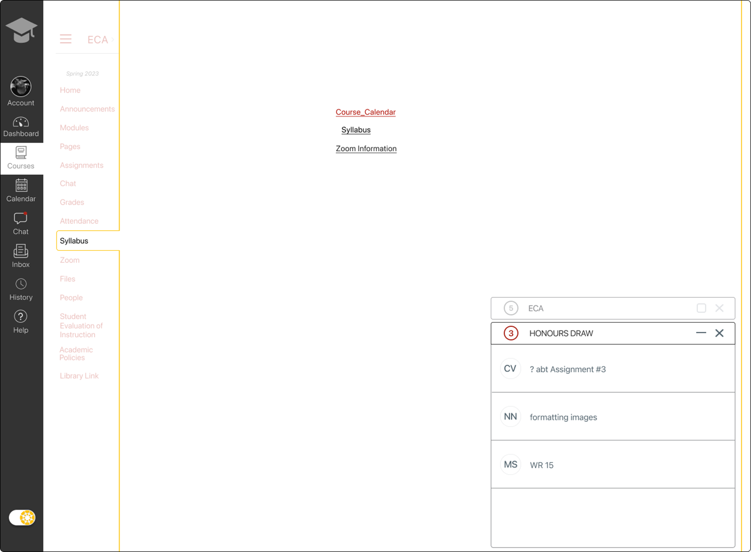
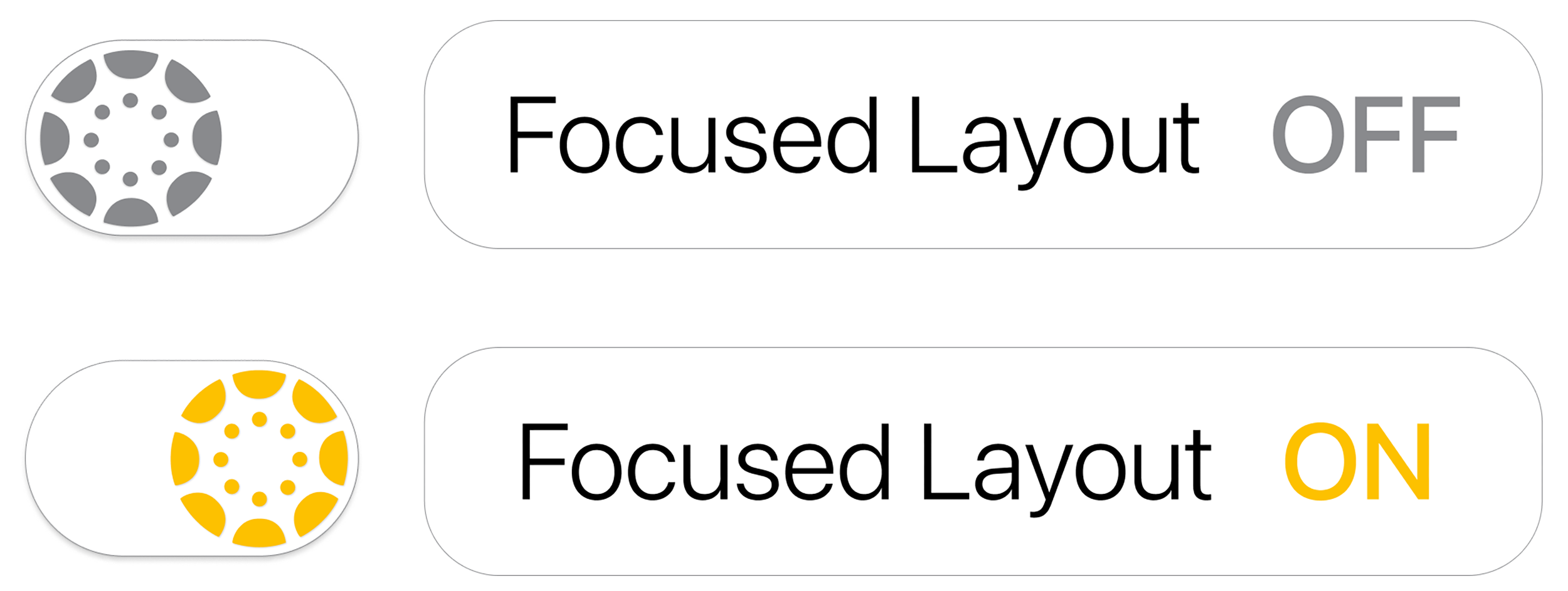
In addition, I created a toggle that allows for a focused layout option. The button is always viewable and the text bubble is revealed on hover.
The yellow hue is from the loading screen on the instructor version of the app. I implemented this yellow as the accent color for the existing Canvas color palette.
Graphics
Mobile & Desktop - Instructor sign-in
Sketches
Instructors will be able to set times to receive chats. Outside of approved times the student will receive an automated reply with a custom message.
Alerts on the lock screen will help instructors preview a message. They can then long press to reply within the lock screen’s extended alert bubble.
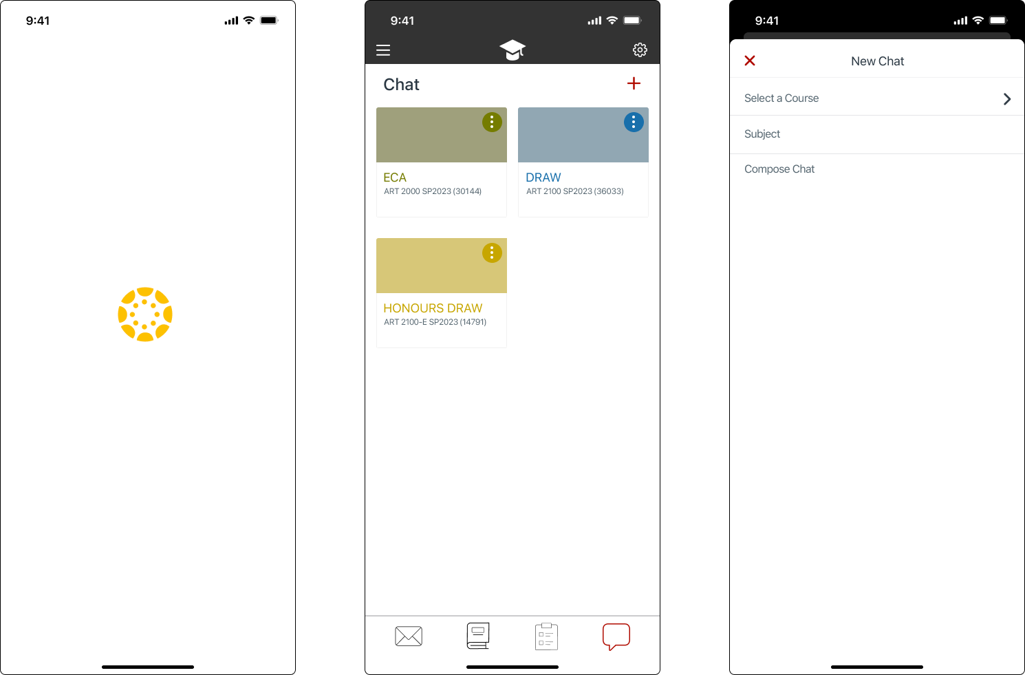
A chat icon is added to the bottom bar for landing screen accessibility. This chat icon will also display an alert bubble for unread messages. The top right-hand corner of the screen contains the + icon to easily begin a new message.
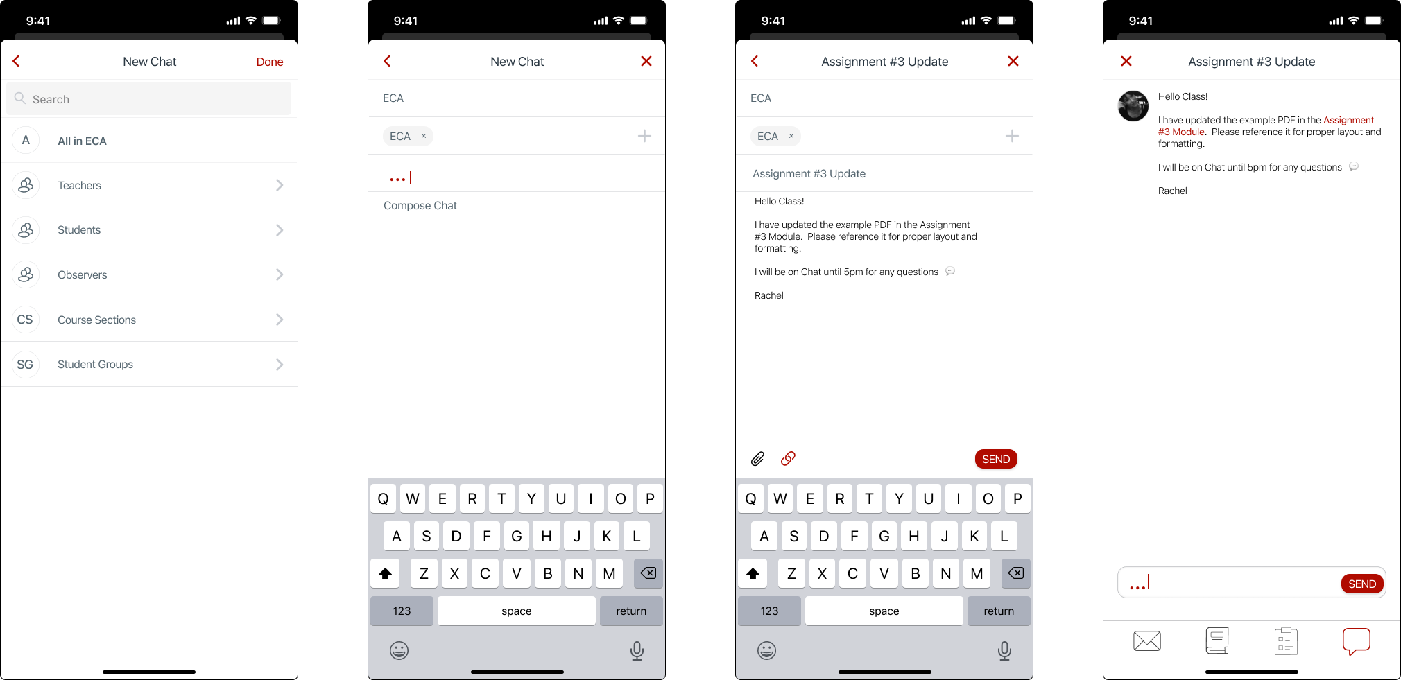
Selecting a course, then a student adheres to the existing process when creating a new mail message in Canvas.
The option to add a Canvas link or a file has been added to the chat. This helps provide quick answers to student questions that already exist on the course shell. It also allows instructors to provide additional files if needed.
The addition of a dedicated CHAT page provides a way to archive messages and see multiple courses at the same time. This allows for the retention requirements at Universities.
A page also provides ample space for instructors to interact with multiple chats at the same time.
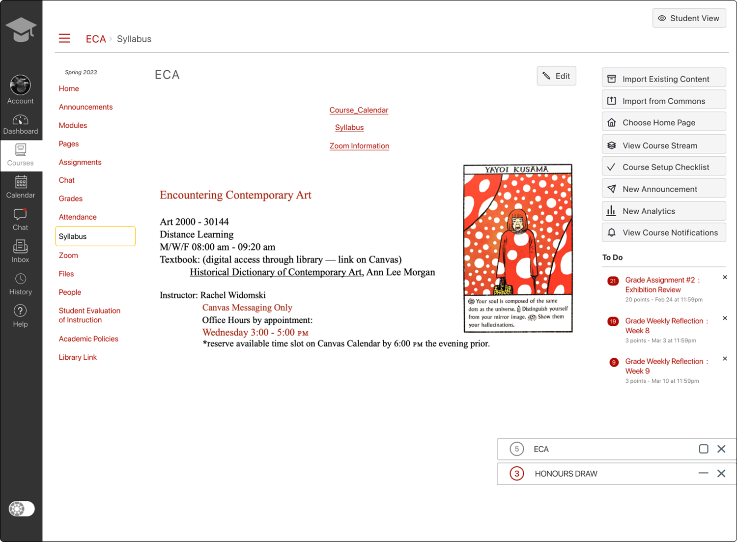
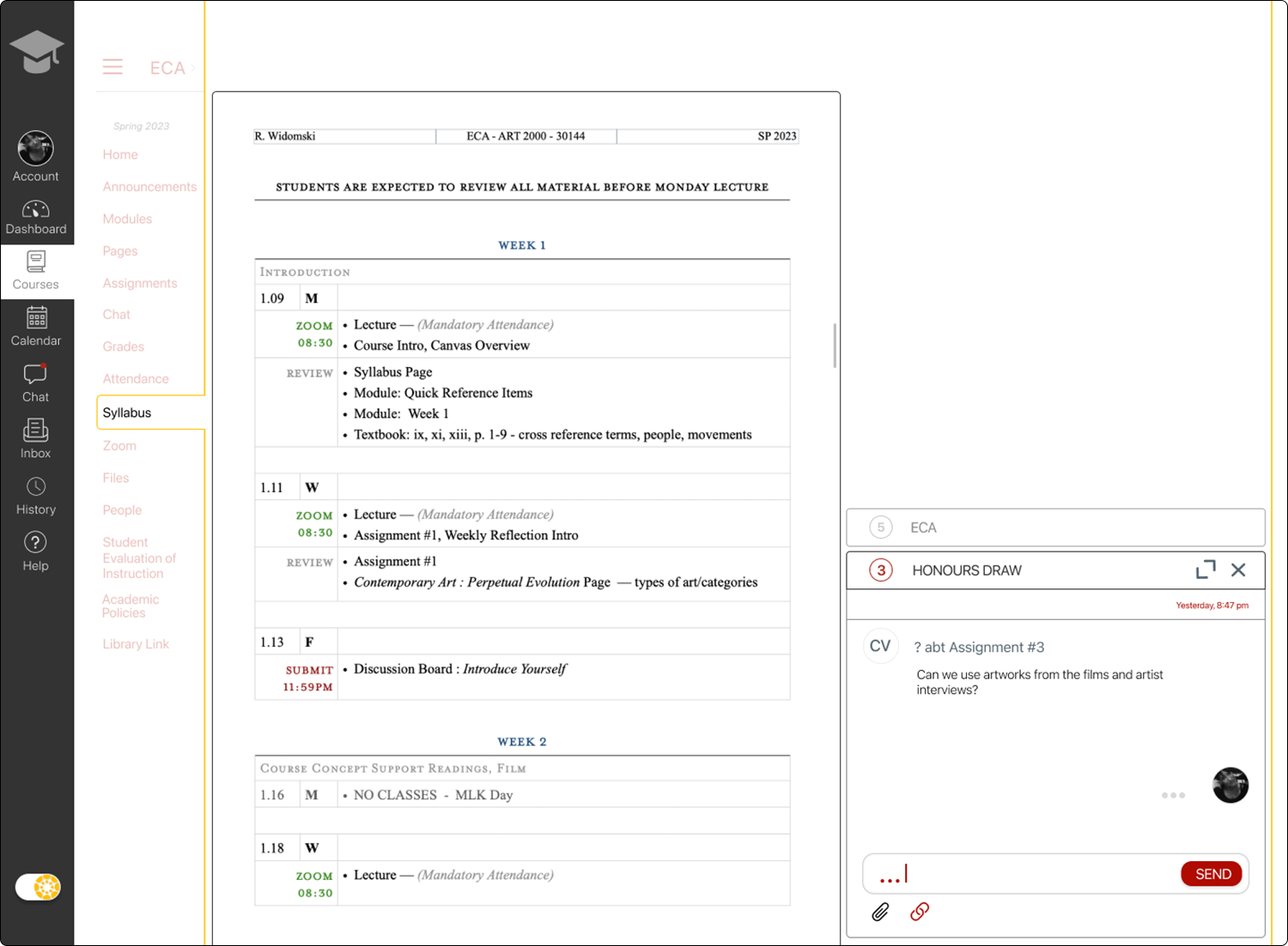
A pop-up chat window allows for simultaneous site navigation.
Multiple alert bars for each course provide instant access to the chat regardless of the course shell the instructor may be working in at the time.
Mobile & Desktop
Wireframes
Hi-Fi, Prototype Testing
Mobile
The mobile prototype testing task flow, creating a new chat, provided a nearly seamless interaction for the testers.
The one change is the addition of a back arrow icon on each screen as well as the re-positioning of the close icon to the right corner.
This design and process are aligned with the existing Canvas format for continuity and brand consistency.
A possible improvement, suggested by one of the test participants, is to allow for navigation through the app while the chat is still active. This element requires consultation with the engineering team and university requirements.
Wireframes
Desktop UI
The Canvas layout is packed with visual elements and lacks the ability to modify the current contents, which was a consistent complaint by instructors.
This complex layout is already confusing because of the content and is further visually complicated by the inclusion of the floating chat.
In order to increase readability I created a toggle option that allows for a simplified version of the current desktop window. Only the essentials for the current page will be listed and the increase in white space provides less visual distraction, whilst allowing for multi-tasking.
To increase readability:
Increased spacing between banners and chat boxes.
Changed the colors on the active and non-active chats, adding a bolder solution for the active chat box.
Hid all icons not in use, and reveal them on hover.
Testing
Iteration
Addition of Focused Layout
Chat Box
Final UI
This was a challenge. At first, I mirrored the existing UI to seamlessly insert the chat option. After a few critiques and revisions, I felt more comfortable developing a design that combined my style choices with the existing brand. I was able to include slight variations in the corners and shape of boxes and a new strategy of using color to highlight important or active areas. I also took a risk when solving the problem of visual overload — creating an option to have a simplified screen that also provides for multitasking on web-based screens.
As a designer
Next steps
Complete another round of testing and iteration for the desktop version.
Add an archival element to the chat screen.
Lessons Learned
It is permissible to look at existing messaging platforms to see common layouts, elements, icons, and processes.
One must consider the requirements of the clients of this application. Universities have requirements for document/communication retention — here it needs to be considered in the design of the instructor version of the platform.
Goals Achieved
The need to remake all the graphic elements for the Canvas web and mobile design helped me become more familiar with the Adobe Illustrator app. I wanted to transition to the iPad for working on smaller designs (logos, icons) and through a good amount of tutorial videos I now have the familiarity necessary with the Adobe apps to easily create using the iPad Pro and Apple Pencil. I think both are important tools for UX/UI planning and design, because it can act like a sketchbook with additional capabilities.


