An existing e-commerce company with clientele on several platforms (social & sales).
Sales of specialty aftermarket auto parts, auto-specific vinyl overlays, and custom vinyl marketing.
US-based small business with international customers and several online points of sale.
Product Designer
Brand Uplift
Research, Interviews, Prototype, Usability Testing, UI Design
Figma, Adobe: Illustrator, Photoshop
Project Duration: 15 weeks research & testing, UI : in current development
Role
CRUX Moto is an eCommerce company that specializes in after-market vehicle modification. They source and re-sell custom vehicle parts, create vinyl pieces for multiple locations on vehicles (ex. chrome black-out), design custom vinyl for businesses, and install custom full car vinyl wraps on location. The client is focusing on the eCommerce portion of the business because of the ROTI.
The customer base has developed over several social platforms and through referrals in the aftermarket/racing car communities. Because of this vast international customer base, the client would like to create an app & begin transitioning from multiple platforms of sale and communication to a central location.
About
An existing e-commerce company has built its clientele on several platforms (social & sales) and would like to streamline user experience whilst organizing user information and sales platforms into one location.
CRUX is a small company, user questions & sales issues are addressed by the owner. Currently, that includes messages from email, phone, eBay, Etsy, Amazon, Facebook, Instagram, TikTok, Youtube, and their website. This requires excessive time allocated to several different locations for answering inquiries & sending promotional alerts. The client wants to consolidate user information and transition to an app-forward experience.
Problem
how might we transition existing customers to one app-based location and minimize the time required for customer management?
Process
Existing Design & Platforms
-
CRUX utilizes multiple sales platforms — eBay & Etsy are the two most used after the Crux website.
The inconsistencies of these platforms requires significant time editing, problem-solving varied, required specifications, and managing customers.
-
I pulled screens from multiple apps that reflect the pain-points determined by client interviews.
These visual references help inform the new design and user flows.
Research
&
Analysis
In-depth Competitive Analysis
-
First, I researched general information about eCommerce apps to discover best practices, common content, and user flows.
-
Next, I approached competitor companies the client listed and investigated their content, app vs. web layout, and branding. I find that customer reviews on company websites and apps are extremely helpful in gaining candid insight about positive and negative elements and user experience. I read through many customer reviews to discover any common pain points.
-
The final thing I investigated in detail is the live chat. Including this feature is a primary feature for the client. This feature will streamline communication and save the client a lot of time currently spent replying on multiple platforms, emails, text messages, and phone calls for all inquiries. I discovered that there are several options for this chat management. The client and I will continue to investigate the best option, hoping to discover one that will forward all social media, sales platform messages, text messages, and emails.
App Comparison
-
Layout and Content.
Onboarding.
Features, search options, & product entries.
Customer reviews on app store.
Consultation with the client about current pain points:
the use of numerous platforms and excessive time spent on customer communication determined the inclusion of a live chat and incentives to join the ‘CRUX Community’ (customer database).
“In app chat”
Interviews
&
Personas
Users desire an ease of navigation.
“How do you prefer to contact customer service whilst using an eCommerce app?”
Users want ease of navigation
Users would like to easily communicate with the company, preferably in-app.
Users want to remain signed in and have their shopping cart items saved automatically.
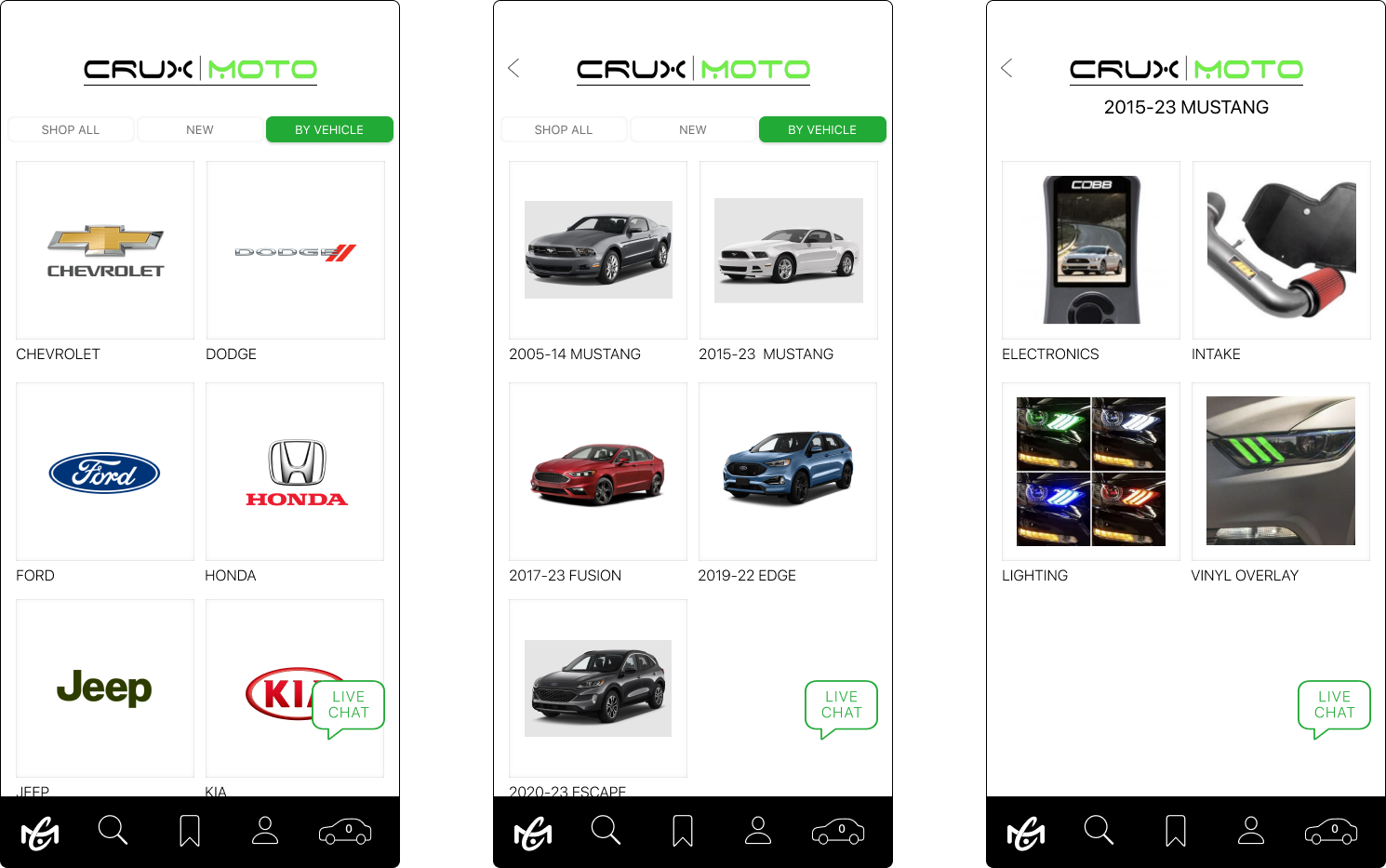
Users would like a more personalized shopping experience including suggested items, and the ability to search content by item or vehicle.
Client Interviews
One reason the client is creating an app is to transition the current customer base from multiple social media and sales platforms into one location. Notifications and customer communication can easily be pushed in one location instead of the several current platforms. This is also an opportunity to consolidate the customer base.
The client wants to include a live chat to streamline communication and reduce the excessive amount of time currently spent responding to customers on several platforms and phone/email. It will also help to answer quick questions about products or the installation of vinyl in real-time.
Insights
CRUX and its users desire a more streamlined communication experience.
Feature
Roadmap
User/Task
Flow
CRUX MOTO is an existing company & they desire to maintain established brand elements. There are opportunities to refine the existing elements — increasing accessibility and reinforcing relationships between image and content. I continue to propose new solutions to the client as we advance the development of the app.
Color Choices
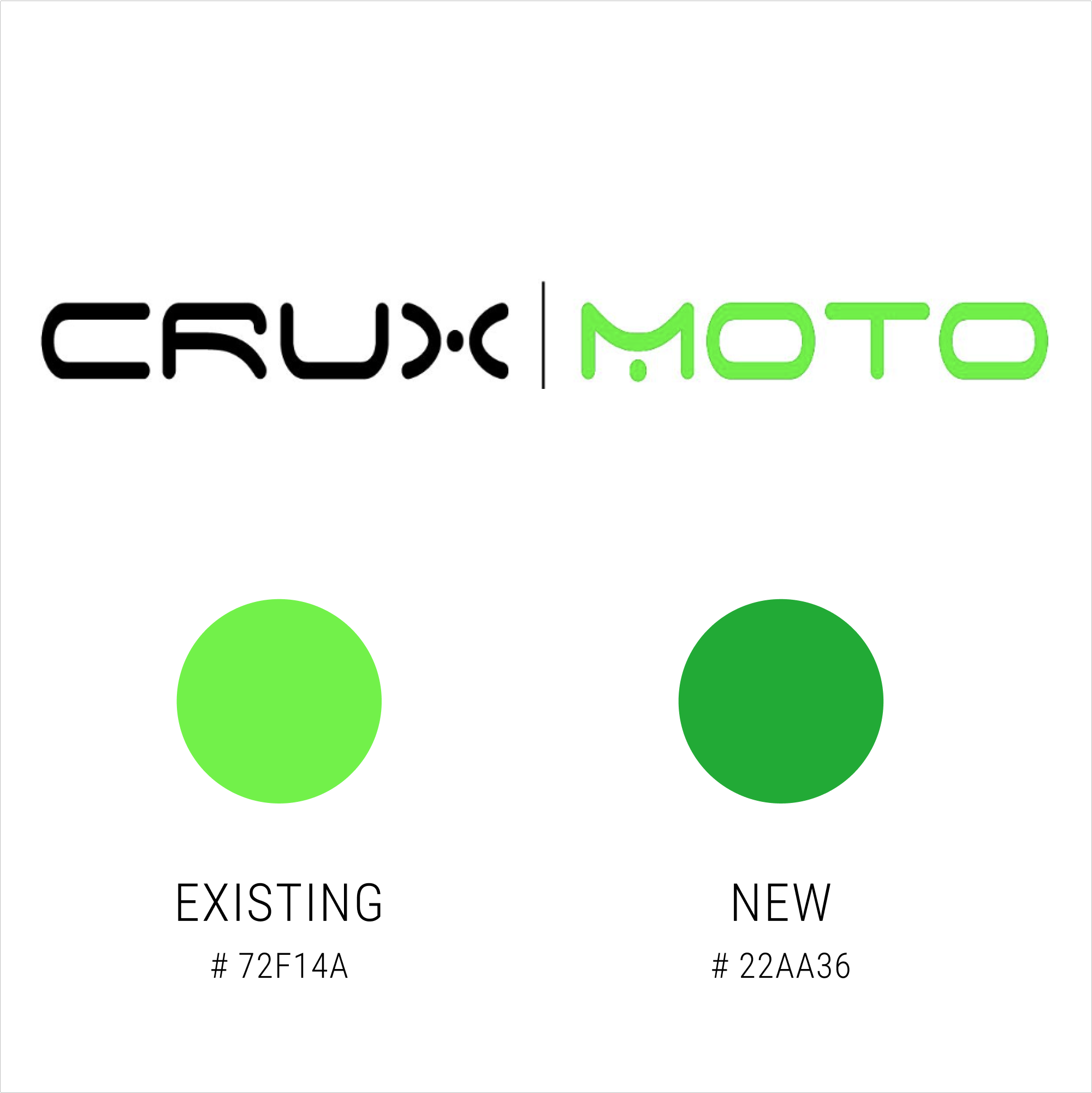
The current logo for CRUX MOTO is nearly a fluorescent green. My initial response was that it is too bright to easily be seen on any color except black. To confirm this instinct I ran an accessibility test and the result confirmed the issue. I presented this to the client along with the change in color that is technically accessible on any screen and also closest to their existing logo.
The client is open to transitioning the remainder of their logo and marketing materials to the new shade of accessible green.
Logo
Using SF Symbols, I created a custom color to use for the icons, some with a slight modification.
The first element is the addition of a live chat feature. This chat bubble will float on all screens and expand when activated by the user’s touch.
The ribbon-like bookmark replaced the standard heart icon which is not aligned with the brand. We are still developing a possible racing flag solution, creating a stronger connection to the company.
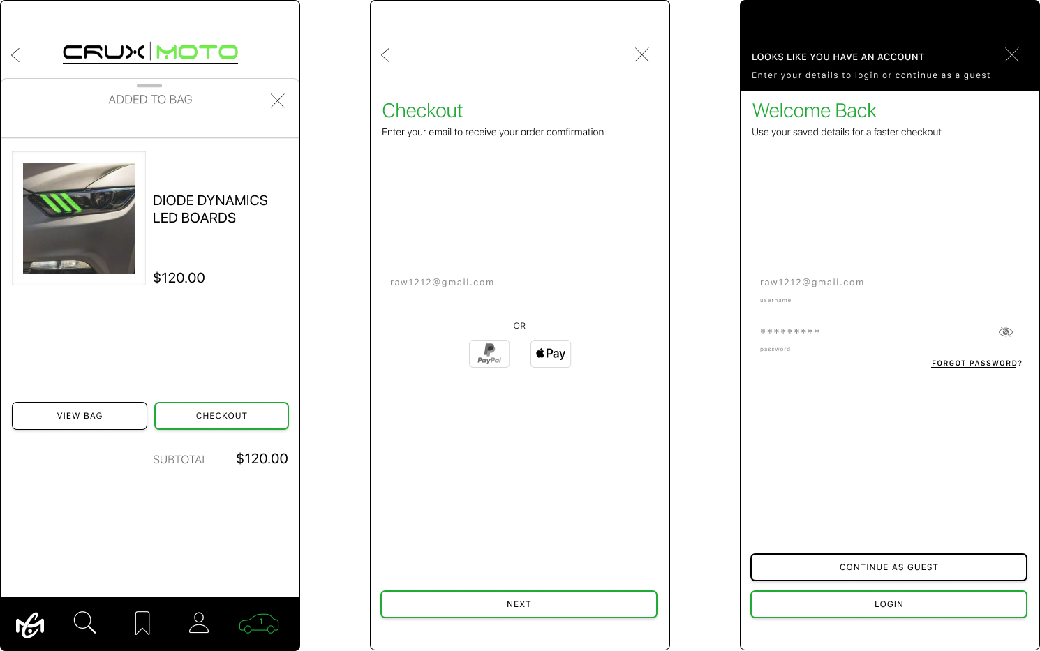
The standard cart is replaced by the car icon which will display the number of items in the user’s bag.
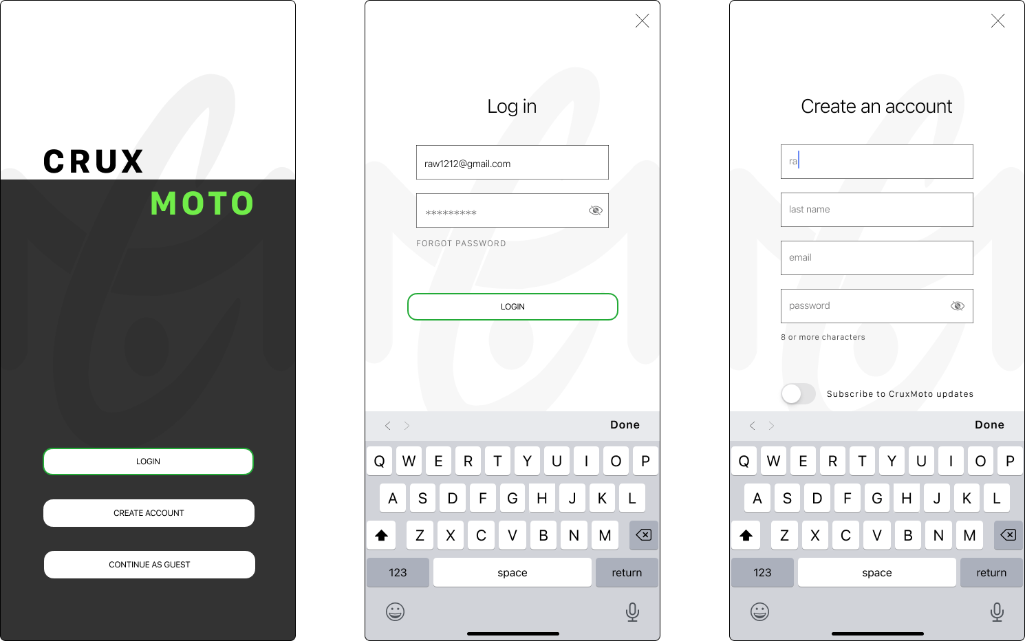
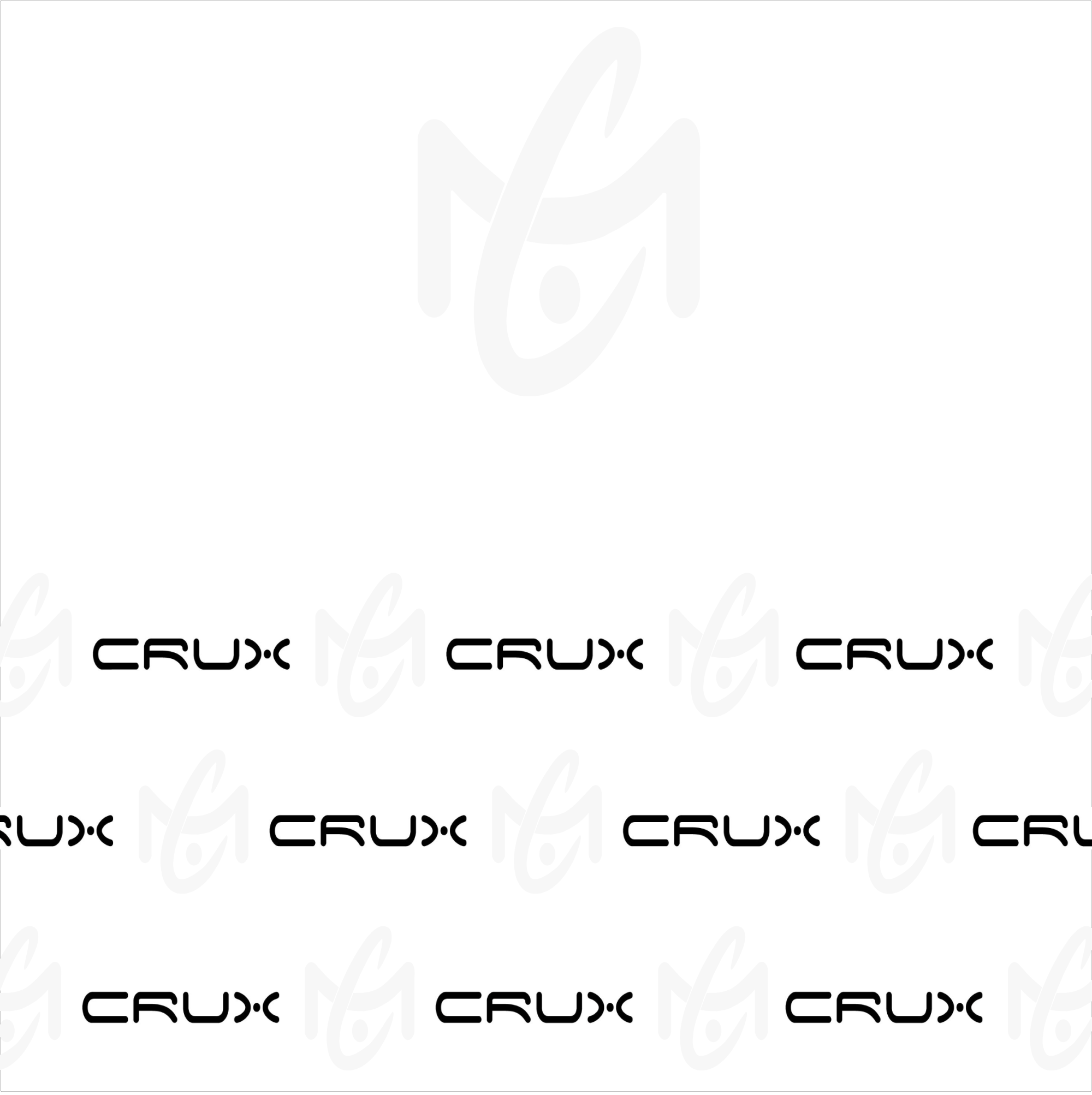
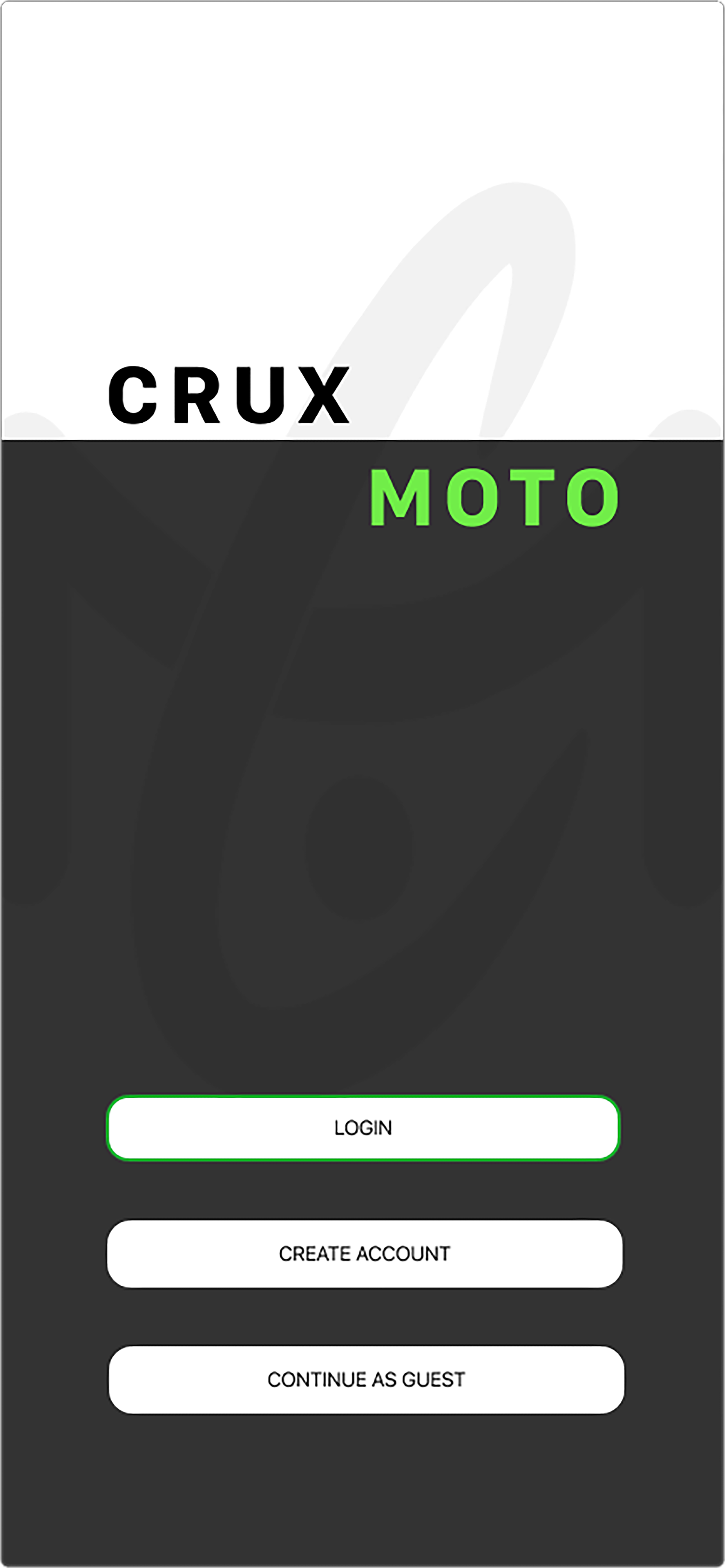
The first alteration to the logo was for the landing screen. I reduced opacity and stretched the logo to create an interesting ghost image increasing depth in the screen.
This version of the logo was also used for a yearly fundraiser step and repeat. The client can envision using versions of this grid design for promotional marketing, stickers, and packaging materials.
Brand
Uplift
Icons
Crux currently uses WooCommerce for the design of the current website. The client would like the app to emulate the website design as much as possible. In the future, there is the possibility of re-making the website to offer more customization. The client prefers the b&w color palette and limited content with a good amount of white space for minimal distraction. The focus needs to be on the listed items. I have suggested reworking some current photos and entries to create a more consistent and clean presentation (currently in progress).
Design
Requirements
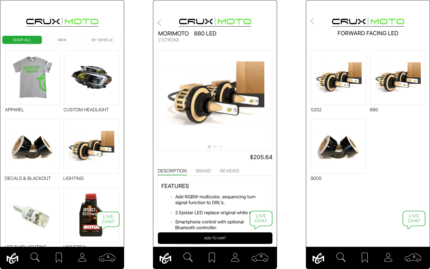
Using a segmented picker allows all the content to be accessible from the landing page. It gives the appearance of one page and minimizes the task flow.
The addition of a live chat was a priority for the client. This chat bubble will float on most screens so users have easy access to the company. The client will save time by having a communication point to answer questions quickly.
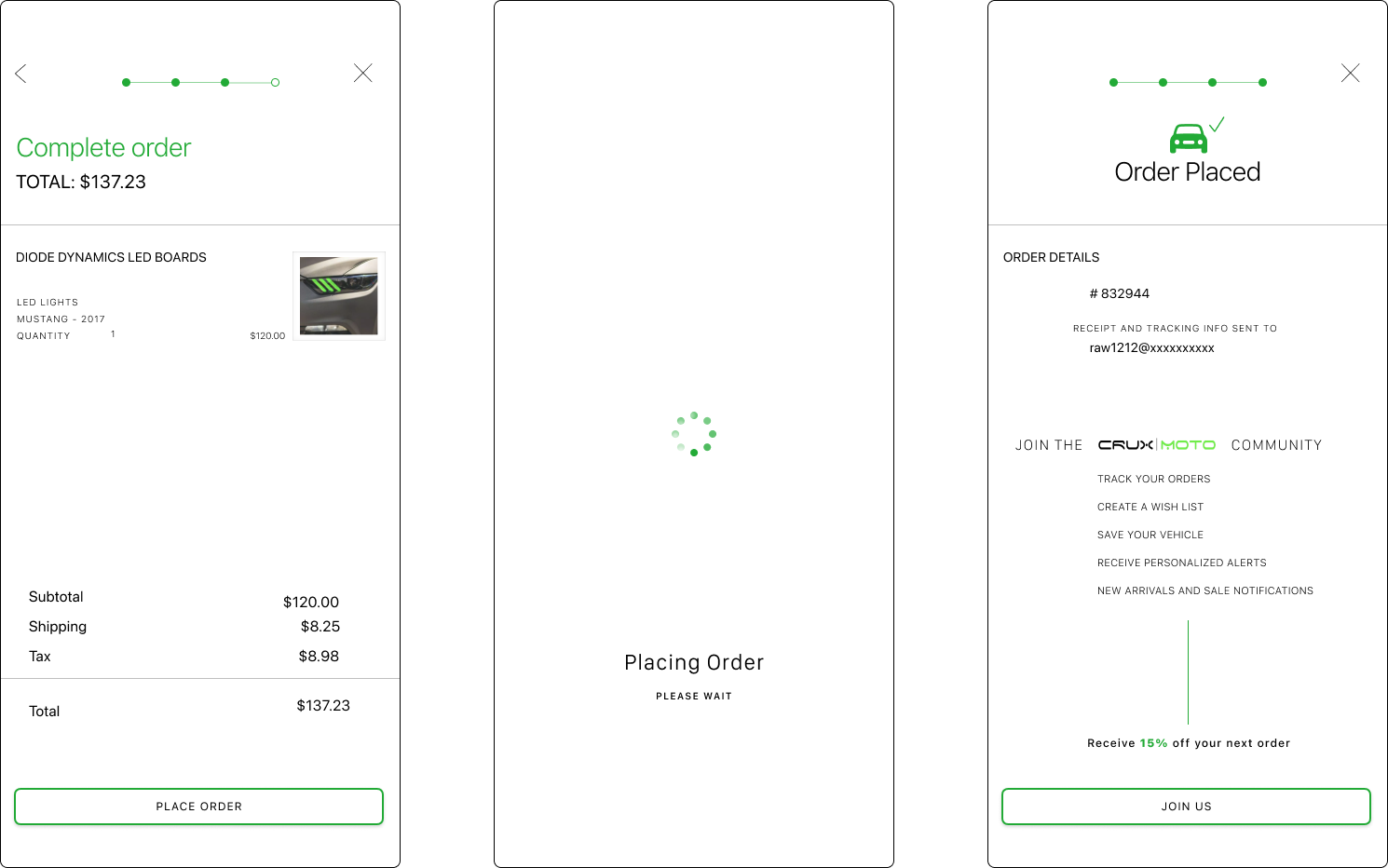
During checkout, the user can see their progress via the bar at the top of the screen. The checkout provides multiple payment options including apple pay and PayPal, addressing feedback from user interviews.
Wireframes
Hi-Fi, Prototype testing
Spacing & Size
In-person testing was completed using my iPhone and the Figma app to get the most accurate experience. Feedback from both the in-person tests alerted me to the spacing issue with the segmented picker. The segments were too close together and resulted in the accidental pressing of another button. I removed the Apple component and created individual buttons, allowing for more spacing and height without compromising the size of the text.
Multiple Subscribe points
The client is using the app to help centralize customer contact information. To ensure this I have include multiple opportunities/prompts for the user to subscribe to CRUX. During one of our conversations the client and I discussed creating an incentive for customers to submit their contact information. (I have encountered this on numerous retail platforms in the past year.) Repeating the toggle prompt present in multiple locations on the 'order placed' screen creates the 3rd encounter during the user flow. My design solution also provides additional graphic interest and expanded information about the Crux community, with the incentive of 15% off the next order.
Loading Screen
A loading screen was created for the onboarding flow and I liked the experience it provided for the user. It is a visual representation of progress when the user may assume the app is frozen. If the user thinks the checkout payment is not processing because of a perceived frozen screen, they are likely to re-submit the form, resulting in a double payment, authorization issues with bank cards, and increased problems for the client.
Wireframes
Testing
Iteration
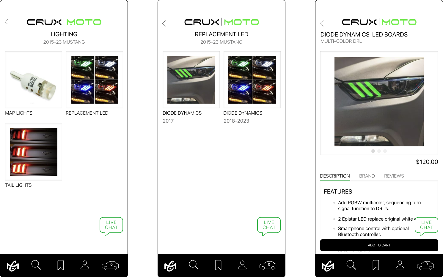
User flow - Sign In/ Create Account, Shop By Vehicle or Shop All, Add Item to Bag & Checkout
UI Kit
Final UI
Prototype
The challenge in this project was creating a design that emulates the existing website. Another problem-solving opportunity was the navigation strategy. Many items on the website are listed in multiple categories including the make and model of the cars. There are a lot of text-based links on the website, so for the app I wanted to simplify the user experience as much as possible. To achieve this I utilized a segmented picker on the landing screen, giving users 3 options to shop: by vehicle, shop all, and by new items.
As a designer
Next steps
This is an ongoing project so I am still working on revising existing images as I develop additional user flows.
Lessons Learned
Allow time to edit images provided by the client. The brand logos were only available in jpeg form, so I had to re-make them in Illustrator. In addition, the images used on the current website needed revision for clarity and consistency.
Goals Achieved
Small changes, like custom icons, have a big impact on the UI design. I updated the brand color to create an accessible solution to the current fluorescent green. I used this hue for buttons, accents, and icons.
