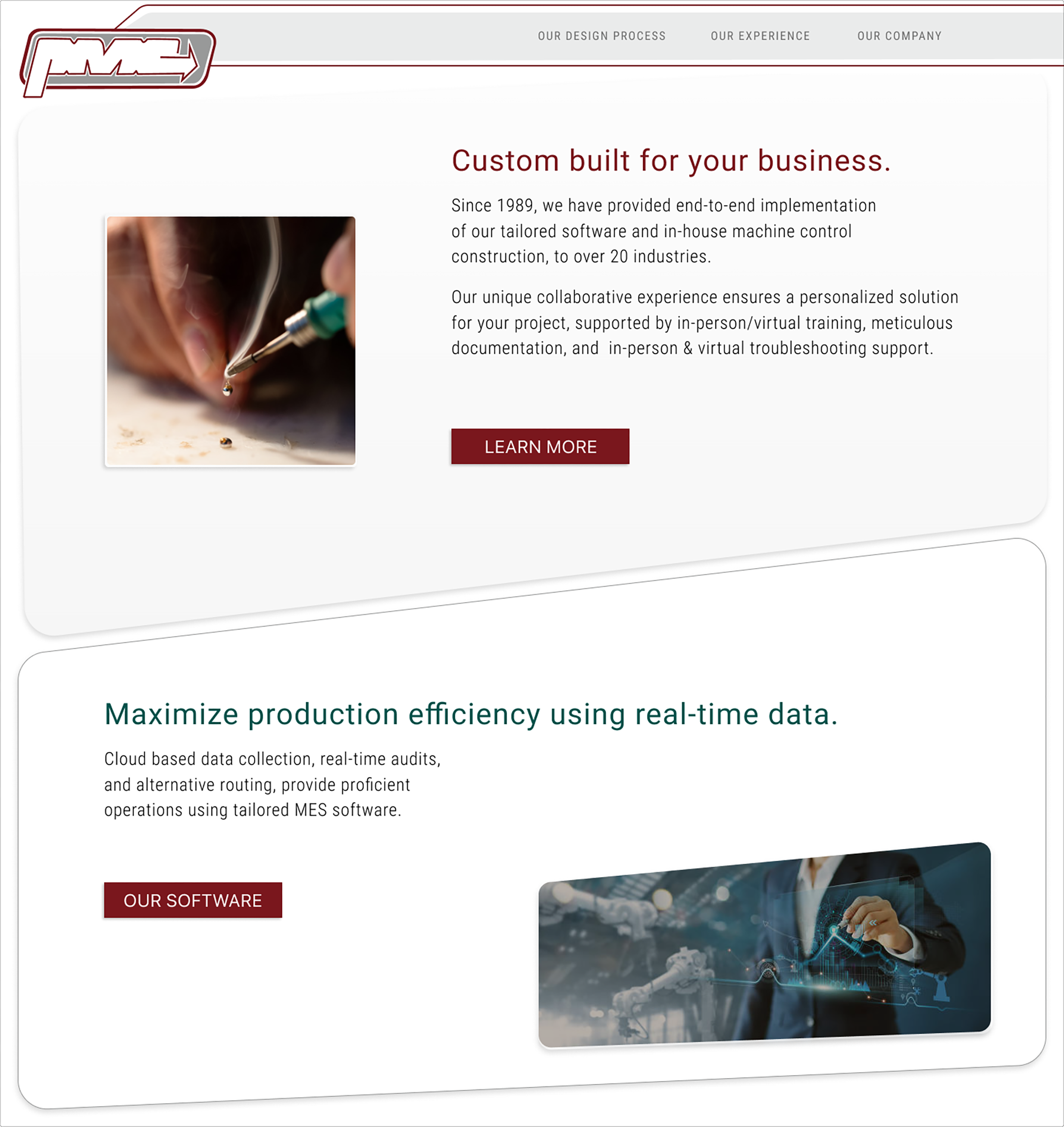
A US-based engineering company specializing in large-scale automation controls.
Experience with 20+ industries, international contracts, and private and government projects.
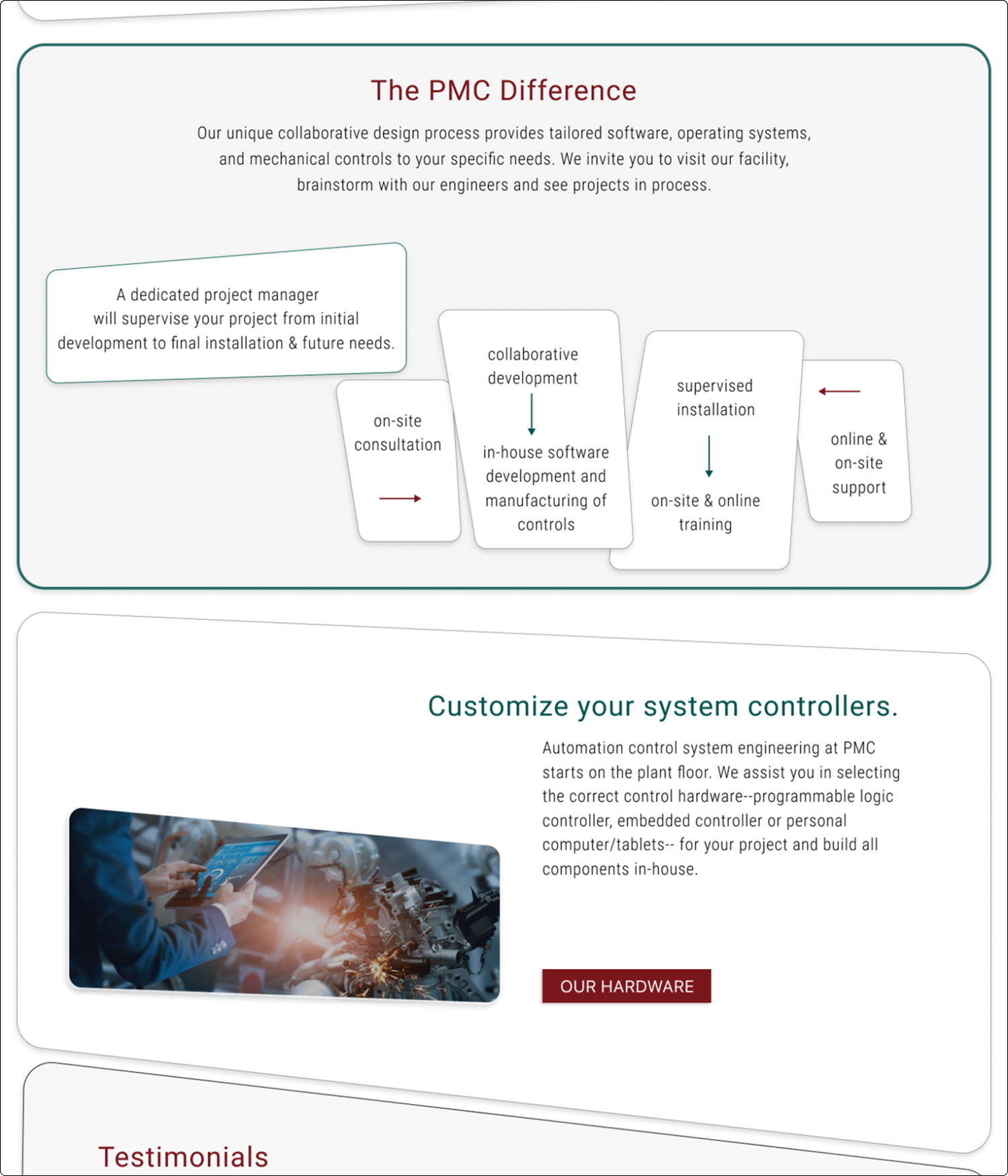
A collaborative design experience creating tailored software and hardware solutions.
Product Designer
Brand Uplift
Research, Interviews, Prototype, Usability Testing, UI Design
Figma, Adobe: Illustrator, Photoshop
Project Duration: 15 weeks research & testing, UI : current development
Role
PMC was founded with less than five employees and has grown into a formidable competitor internationally. The company has expanded over the years because of its impeccable attention to detail and most of its customers now come from referrals. They do not need to market the company online to gain clients so the PMC website, created in the mid-1990s, has not been updated since.
The current website is non-responsive, text-heavy, does not clearly communicate engineering information to non-engineers, and does not highlight the valued qualities that have grown PMC into a successful international company.
About
PMC founded its company with less than five employees and has grown into a formidable competitor internationally. The company has expanded over the years because of its impeccable attention to detail and most of its customers now come from referrals. They do not need to market the company online to gain clients so the PMC website, created in the mid-1990s, has not been updated since.
The current website is non-responsive, text-heavy, does not clearly communicate engineering information to non-engineers, and does not highlight the valued qualities that have grown PMC into a successful international company.
Problem
How might we restructure the text-based website to highlight the qualities of the company and communicate complex content to all audiences ?
Process
Visual Comparison Research
I reviewed several other companies, larger than PMC but delivering the same products and services to similar industries.
I focused on the following:
Is there a navigation bar or a hamburger?
How are complex processes and software communicated?
What type of visual communication graphics are utilized?
1st Markup of Current Website
I completed several markups of the existing website.
The first mark-up focused on categorizing the text so I could decide on the content of pages.
In this process I discovered instances of important qualities of the company that were lost in the sea of text. I decided these were important things to highlight in the design.
This process also helped my form the “our design process” page.
Engineering Research
The information on this website is complex and required an extensive amount of research to effectively approach a re-design.
I researched all terms and processes on the website for several weeks to gain the necessary level of understanding.
Research
&
Analysis
How might we present complex content using visual communication graphics that are understandable by all users?
Results
5 participants were given the contents in this graphic and directed to create an open sort (no directions, just terms on cards).
The content of the website is esoteric to those not familiar with the engineering discipline. The results were inconsistent from the card-sorting exercise. There were some groupings with industries and company information.
The graphic to the left contains my organization of the cardsort contents. This is also informed by my 1st markup of the current website.
Cardsort
client interviews
The client explained how the website has not been updated because they do not use it for client communication or marketing. Currently, it is merely a placeholder and marker of existence on the web.
The client is attached to the current logo but could be persuaded with minimal updates that modify the visual design.
PMC prefers a minimal design and does not want a “flashy” result “like the current app and social media'“.
We discussed the current website and my markup of categories and I highlighted the positive qualities of the company and process that are currently hidden in the text on numerous pages. I communicated my intent to focus on these aspects and possibly create dedicated pages that highlight the employees, process, and the company's attention to detail.
Interviews
Insights
It is necessary to create a visual style representative of the organization and precision present in the company’s process.
Site Map
Color Palette
Color Choices
Since PMC is an established company with a desire to retain its branding, there was little flexibility with the color selection. However, the consistency of the red and gray color palette required at least one accent color to create contrast.
My familiarity with the owner of the company provided insight into how I needed to present this option —logically and with relatable and solid reasoning.
Searching for a color solution I turned to the collection of engineering photos I had already pulled for the UI design. The circuit board is a familiar sight in the PMC production space and it provides both a tangible relationship and a complementary color selection.
I selected several green options from both of the photos. The contrasting color that works best with the existing color palette also provides accessibility when used for text on the website.
The conceptual structure of my choice was appreciated by the client and they agreed to include it in the website. They may also use it in printed materials in the future
Branding
Uplift
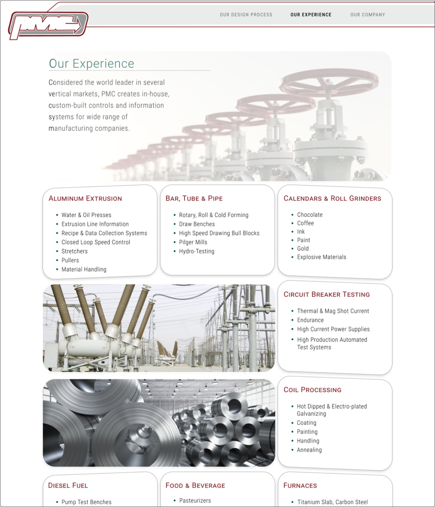
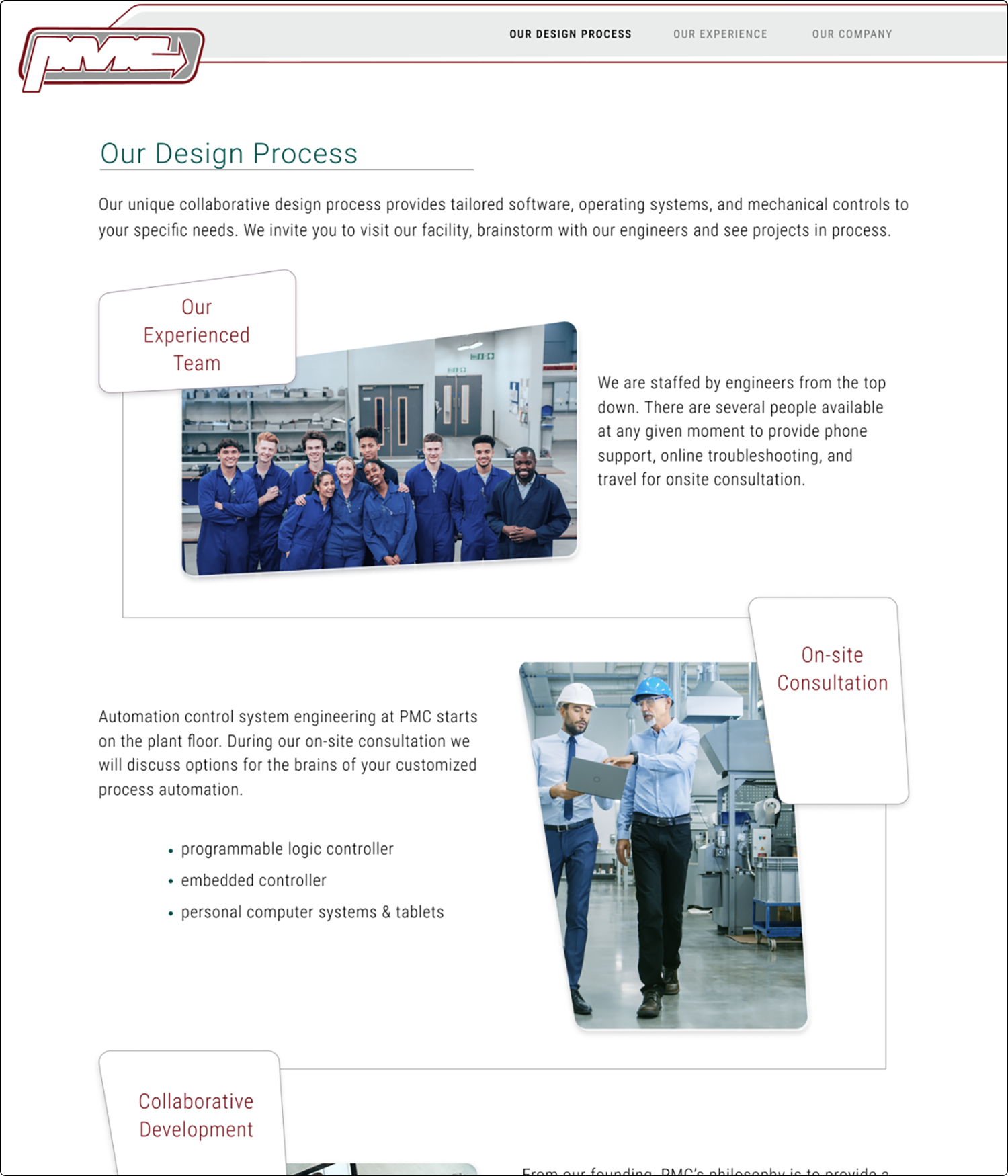
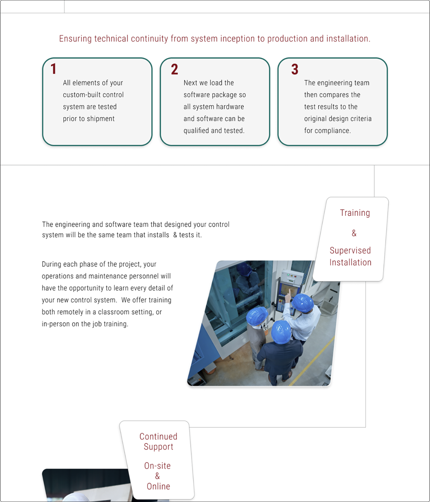
This is the first page I approached for re-design. The current website is solely text-based and contains a lot of information. I began by focusing on the categories. Again, it was necessary to complete additional research. The research provided the necessary information to revise some of the text copy and create 19 headings with more detailed information listed below.
I wanted to include images to break up the text and also use graphic elements to give structure and space. These choices in design help the reader ingest the text-heavy content, it is a strategy I often employ when making lecture presentations for my Contemporary Art course.
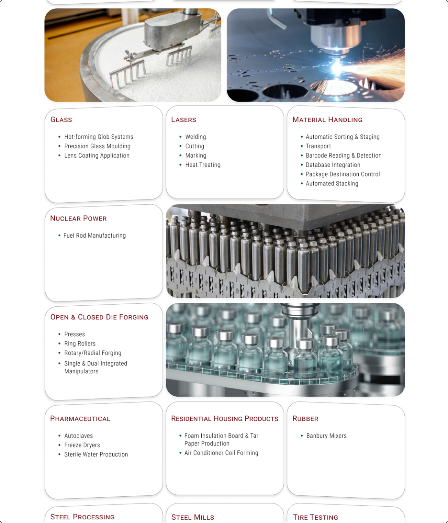
I spent a couple of days searching for the appropriate imagery*, editing the images for a consistent color tone, and creating masks to enmesh the photos with the other shapes in the grid. The shapes are a modified version of the ones I created for the landing page.**
The first version of this page contained larger shapes but the design resulted in a very long scrolling to view the 19 topics. To remedy this problem I made each shape smaller. The size was determined by the heading with the most amount of detailed information that needed to be listed in the shape. In the prototype version, the lines under each heading were removed, and the spacing between lines slightly increased.
*Purchased from iStock to maintain consistency of style.
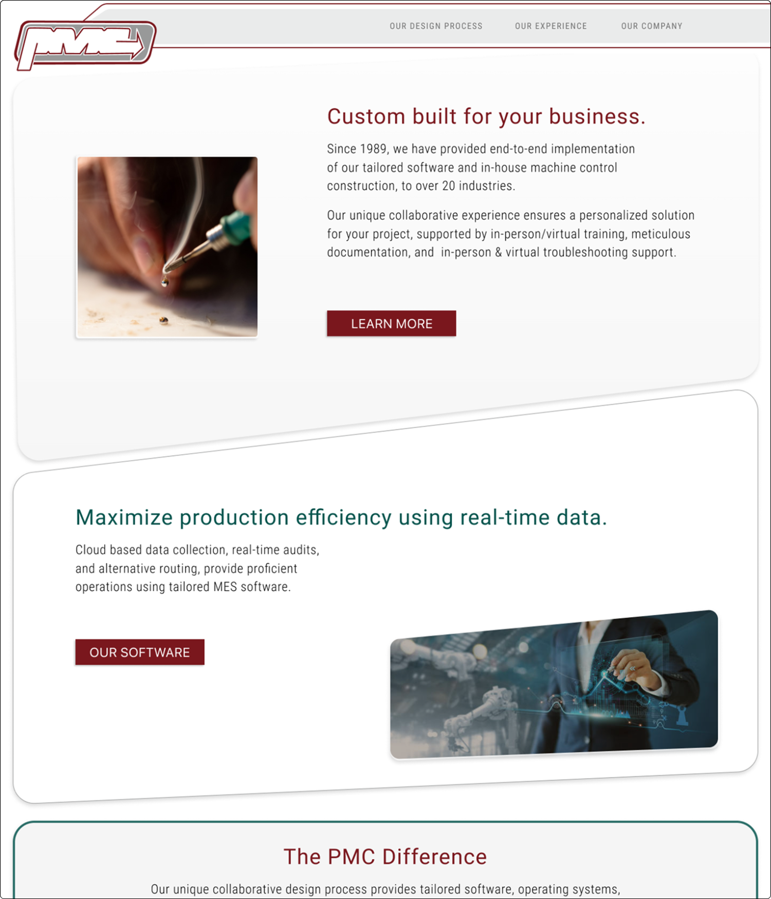
**These shapes are consistently used throughout the site mirrored, rotated, and transformed in scale.
Design
Transformation
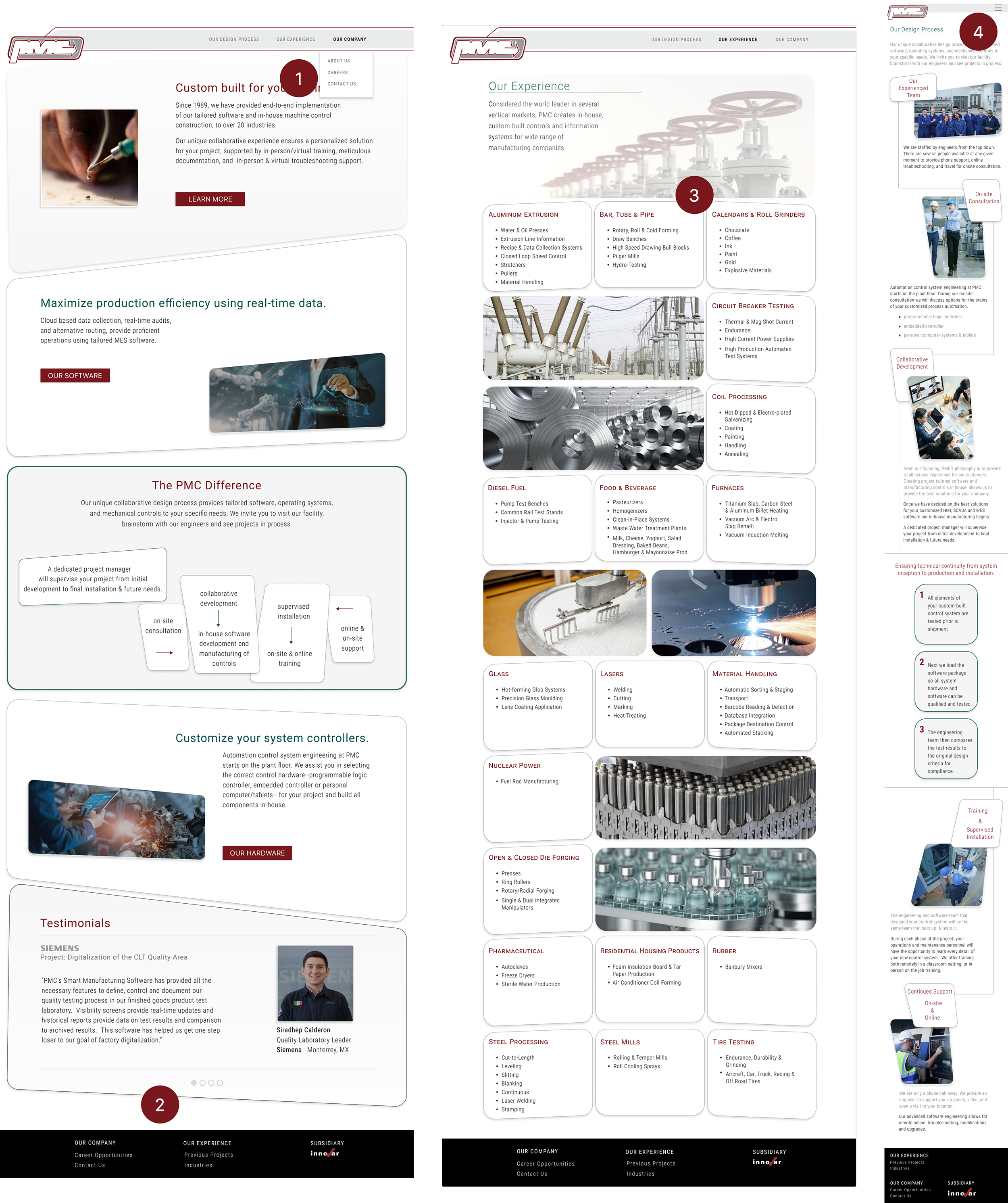
An overarching influence I wanted to incorporate into the design is the circuit board. The board is a staple of the PMC construction of the system controls. It contains both the grid and a variable design of applied parts. This was my inspiration for a connected series of content boxes.
My initial design used a hamburger menu to nest the multiple categories in a compact space. This is the solution Siemens (a competitor) uses for their website.
After creating the v.1 HiFi prototype I met with the client. They did not want the hamburger solution because it is too close to an app and they were concerned about the age and familiarity of this feature to current clientele. Their preference was the traditional navigation bar, so I implemented that solution in the next version of the UI design..
It was important to create a page highlighting the leaders in the company. Often the President and the VP of Engineering first visit the client at a new project location. I believe it is important to have photos along with the contact information to reinforce the personalized service and accessibility to the team.
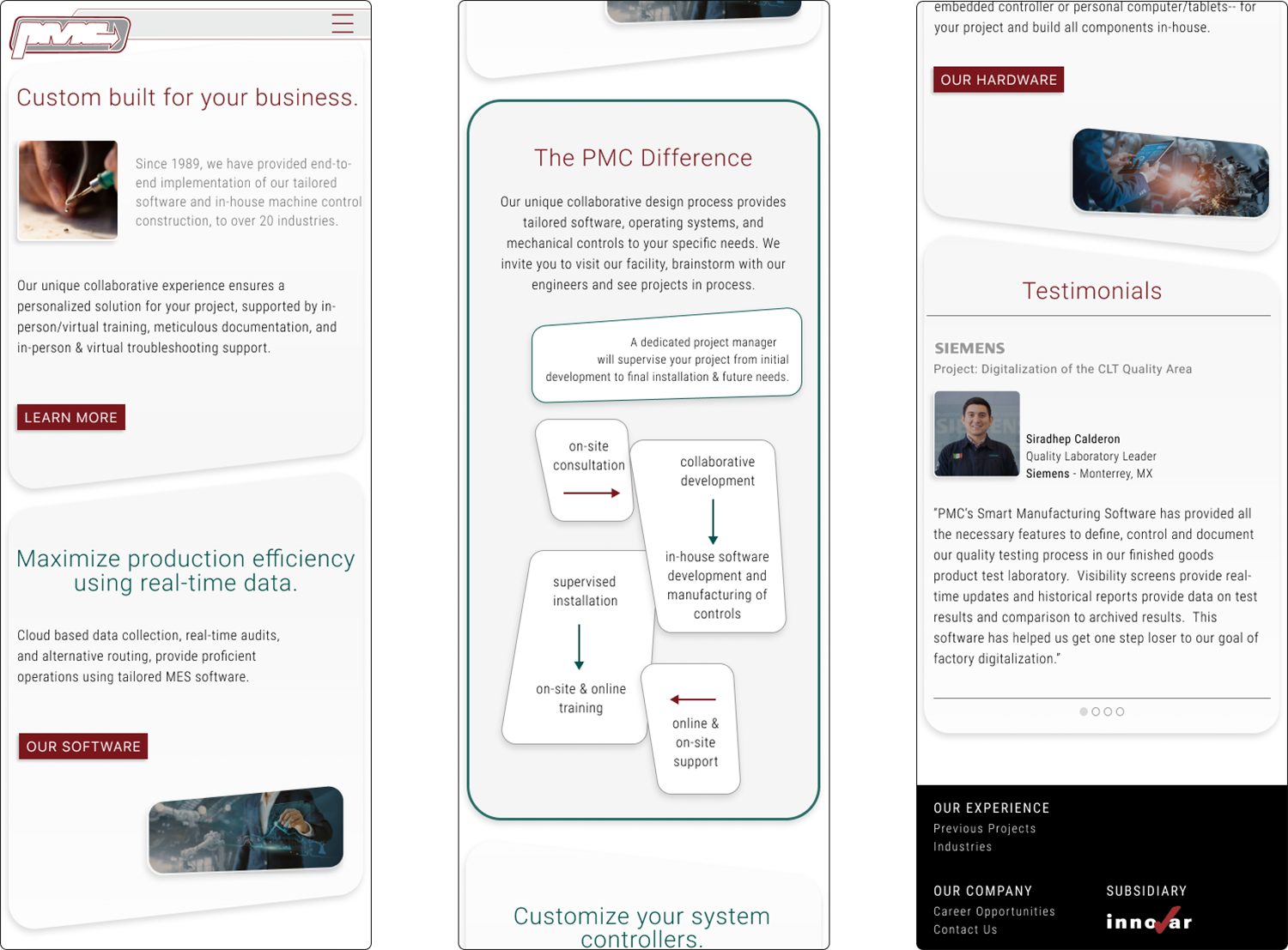
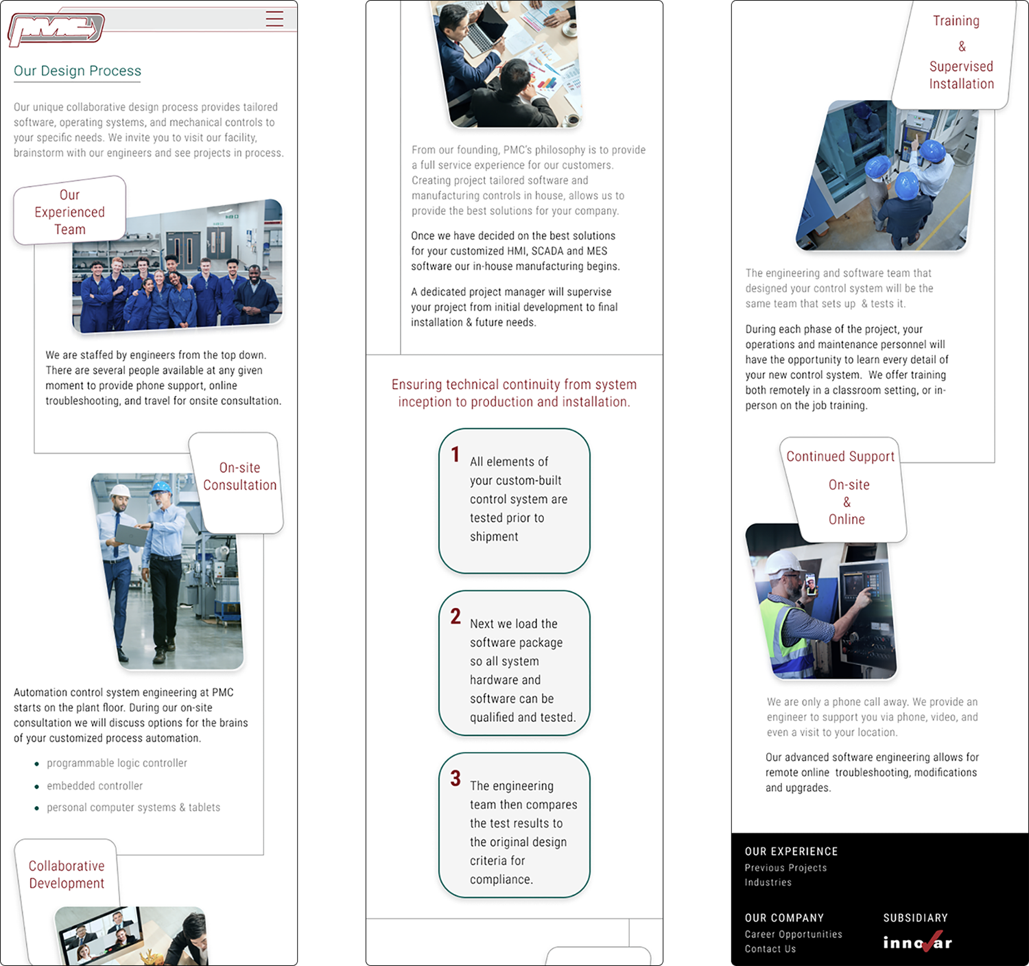
Mobile & Desktop
Wireframes
Prototype
Testing
Iteration
&
The initial solution for the drop-down menu was a hover feature. During testing, participants had issues maintaining the hover menu expansion whilst trying to select one of the links. To remedy this issue I kept the hover for the first drop-down menu and then used an 'on-click' feature for subsequent selections.
In the first version, I used the gray of the logo for the background of the footer. User feedback stated that the contrast was low and it was difficult to see the text links. To fix this problem I decided to use black and white for maximum contrast that did not conflict with the ‘innovar’ company graphic link.
The main issue on this mobile screen was a feeling of a cramped layout. To improve readability I changed the sizes of the images and the text headings in the shapes and moved all body text below each image. I increased the size of the text and varied the color and thickness to create additional separation to aid in legibility.
Feedback revealed that the line was distracting and blended with the color text headings, so I removed all the red underlines on each shape. This modification provided additional areas to increase spacing within each shape and ensure the best level of readability.
Final UI
This is a very challenging but rewarding project. I enjoy the creative brainstorming involved working with only text provided by client. The need to reorganize the content into a more relatable structure, that also highlights the unique qualities of the company, has been an engaging problem to solve. I have created several sketches and lo-fi paper based screen layouts.
My fine art practice sometimes involves arranging images in space, on a table or a wall, to create collage paintings & drawings. I have used this process to design the pages in this project.
As a designer
Next steps
This is an ongoing project. Because of my relation to the client, I have ongoing communication opportunities as I develop additional content. I also need professional headshots to use on the About Us page (current images are place holders).
I do not have a deadline from the client but intend to hand off the approved design before the end of the year.
Lessons Learned
Allow time for topical research. In order to design one must understand the content. This information was like reading a foreign language when I first started, it took several weeks of research to fully comprehend the content.
Budget for images. It is important to maintain a consistent style of visual additions, I decided this was best achieved by using iStock for images.
Goals Achieved
I effectively transformed a text only design into a visually engaging solution using design principles: repetition, rhythm, color placement and carefully selected images.
I integrated my artistic practice into the designing of this website which is a satisfying merging of skill and creativity.
