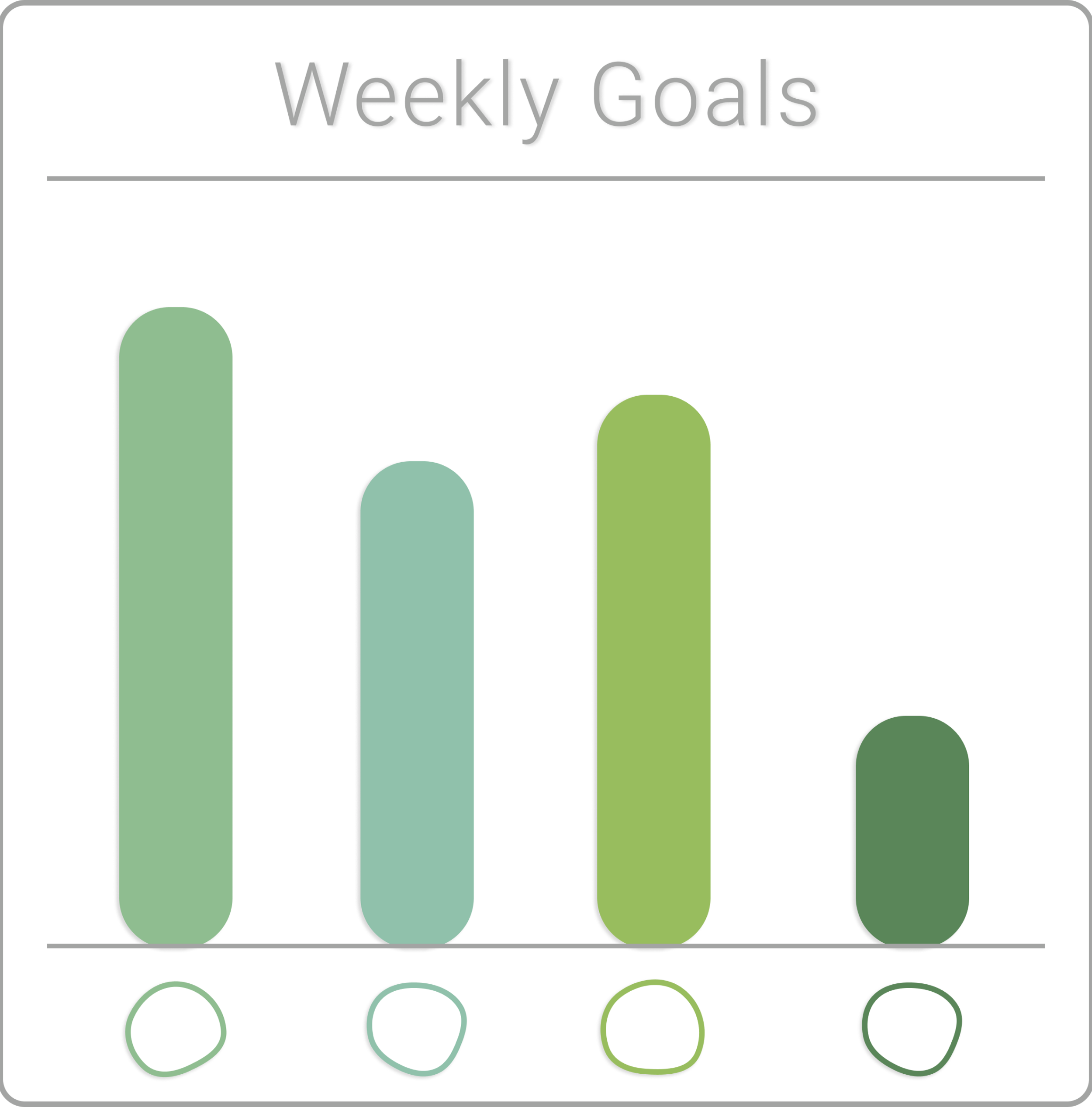
A highly customizable goal tracker.
Individualized, unique, text-based reminders & check-in tracking.
Coaching tones range from stern to encouraging for tailored motivation & retention.
Product Designer (student project)
Role
Brand Development
Research, Interviews, Prototype, Usability Testing, UI Design
Figma, Adobe: Illustrator, Photoshop, Premiere Pro
Project Duration: 15 weeks
About
Echo is a goal-tracking platform that uses unique features to solve the most prominent problem with tracking platforms—retaining the user after a lapse in participation. Busy professionals, parents, those who want to include a new goal in their routine, and previous habit-tracking users all benefit from a streamlined interaction with a tracking platform. With busy work and life schedules new habits and goals easily get pushed aside, and after a few missed days users did not return to the tracking platform.
Echo simplifies user tracking by using text-based communication, providing personalized interactions, and replacing easily ignored alerts from other habit-tracking apps. This highly customizable platform creates positive, encouraging, empathetic interactions retaining users even when there is a lapse in participation.
Problem
Even with the best intentions, the desire to include activities in our schedules that enrich our well-being often falls victim to other obligations or negative habits.
Existing habit-tracking apps become another ubiquitous square on the screen. Reminders and alerts are easily ignored during a bustling day and the intent to ‘make time later’ is a perpetual solution.
How might we increase the effectiveness of goal tracking in a digital platform, encourage continued engagement, and retain users?
Process
-
Onboarding, Subscription Info, Reminders, Features, Customizable options, Web-based version, Developer descriptions, Reviews (positive & negative common points)
-
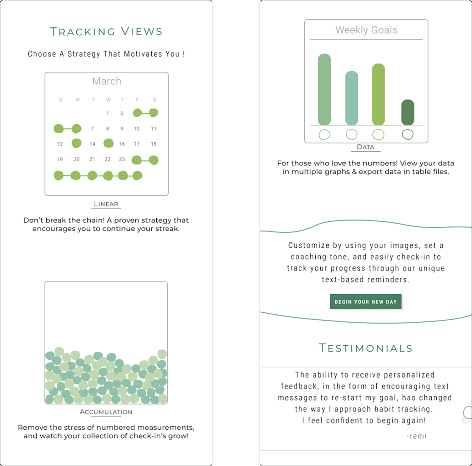
Most tracking apps use a calendar-style visualization of data.
The ‘everyday’ app has both color and shape based visualization resulting in many positive reviews from users.
-
Blues and Greens.
Most app names are a variant on the word ‘habit’.
-
Users prefer a high level of visual customization.
The cost of a subscription is a consistent complaint.
Users would like the ability to track on the lock screen instead of signing into the app every time.
-
Focuses on overall well-being, not only the weight loss.
Psychological & emotional behaviors are illuminated to the user.
The user is able to track other healthy habits & add daily notes.
Research
&
Analysis
Customer reviews of competitor apps provided insight into user issues and desired features, aiding in future decision-making for echo’s content.
“ I ignore alerts”
Interviews
&
Personas
“… then it’s too late, I’m in work mode.”
“A few lines of text on the lock screen would make me stop to pay attention”
“By the end of the day Ido not have the brain power …”
Insights
-
Users ignore alerts from apps but would pay attention to a brief text message.
Users abandon tracking apps when they miss a couple of days, and rarely return.
Users need accountability & encouragement.
Users want options for personalization (interactions & visual elements).
-
When alerted by an app to re-start their tracking after a lapse.
When reviewing calendar or graph/statistical-based data.
To prevent these pain points ECHO uses personal text messaging & alternate accumulation-based visual options for tracking & viewing data.
Feature
Roadmap
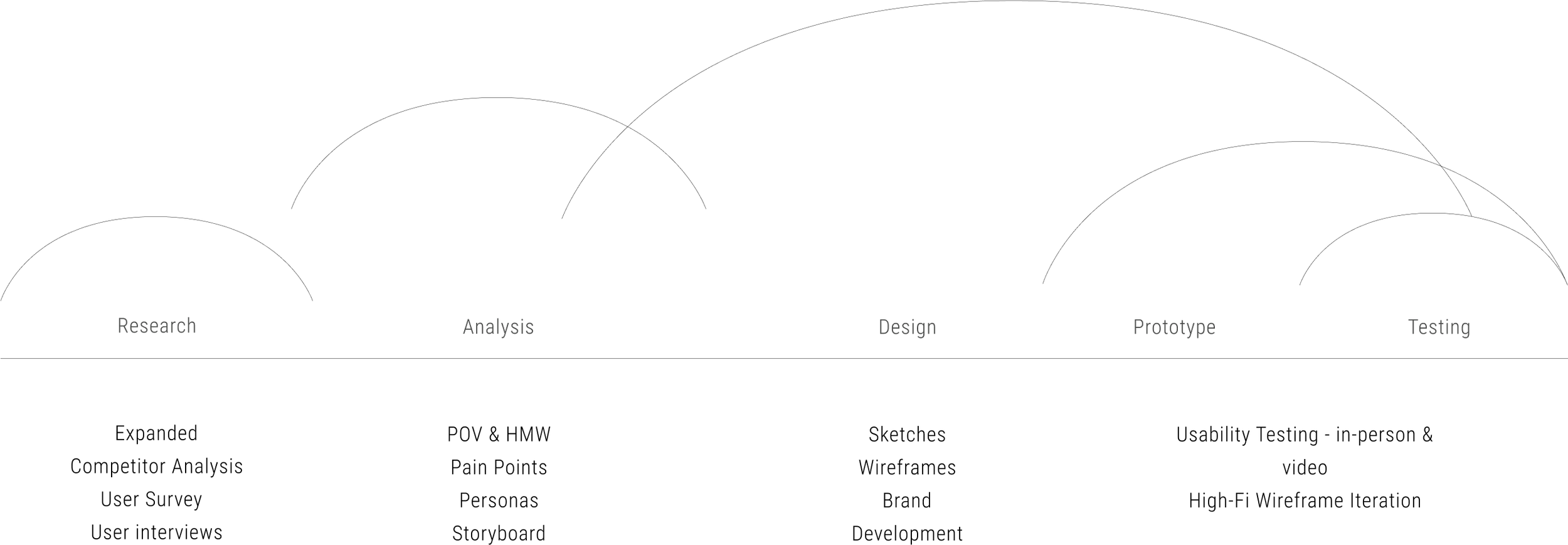
Research & Development Strategy
Branding
Mindmap - Investigative research topics and language associations
Color Palette
My Process
Highpoint, Repetition, cyclical, balance, ripples, pause, rhythm, zen
This strategy stems from my fine art practice.
Beginning with imagery allows me to harness a non-linear strategy and arrangement of elements. I then connect this to conceptual influences. From this, I am able to create groups of images and relational topics to further investigate.
I often use mind mapping to allow for fluid connections, a way to track stream-of-consciousness research and investigation.
Color Choices
The initial color choice was based on the psychological associations of green with nature and growth.
The green I chose is Pantone emerald. It is less predictable than pure green and had a nice range of color relationships.
An emerald also contains associations to the conceptual framework of the brand -- incites focus, provides clarity, brings awareness, and strengthens memory.
Logo
ECHO was chosen as the brand name because of the visual association with rhythmic repetition in physics as well as the meaning of the word.
The logo uses a rounded type and the inclusion of repeated circular elements are a visual representation of the aforementioned meanings.
Originally the repeated circular elements were perfect circles, but I further developed the shapes to embrace the irregularity of nature, movement, and associations of development and formation.
Icons
I created these amorphous brand-specific icons to reinforce associations with nature, growth, and irregular repetition. The development started with the research image board with several subsequent iterations.
Existing commonly used icons are too static and perfect. I wanted to connect concepts of balance, nature, growth, and irregularity present in the UI design, logos, and conceptual framework of the brand.
Design
Elements
Custom graphics
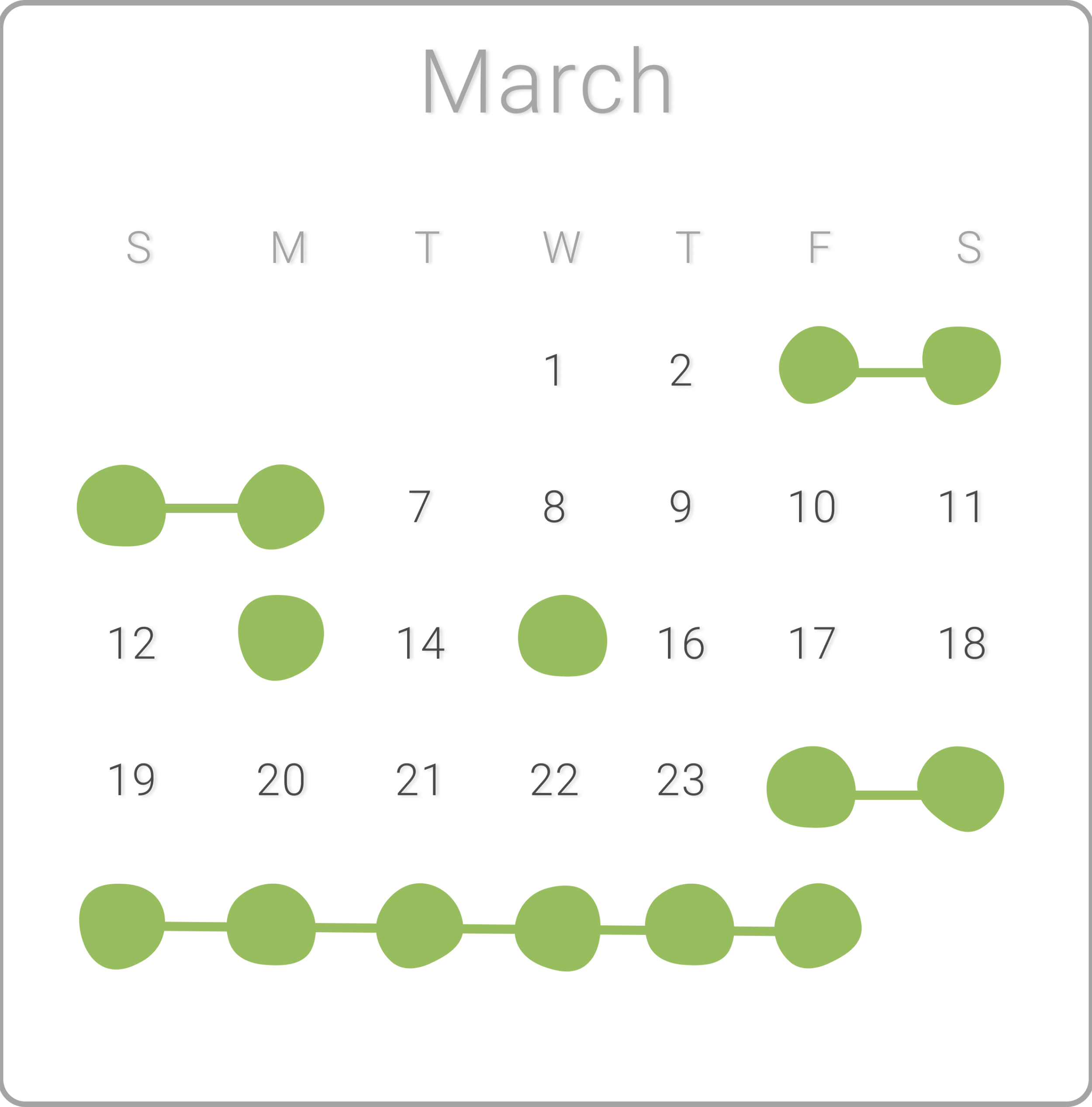
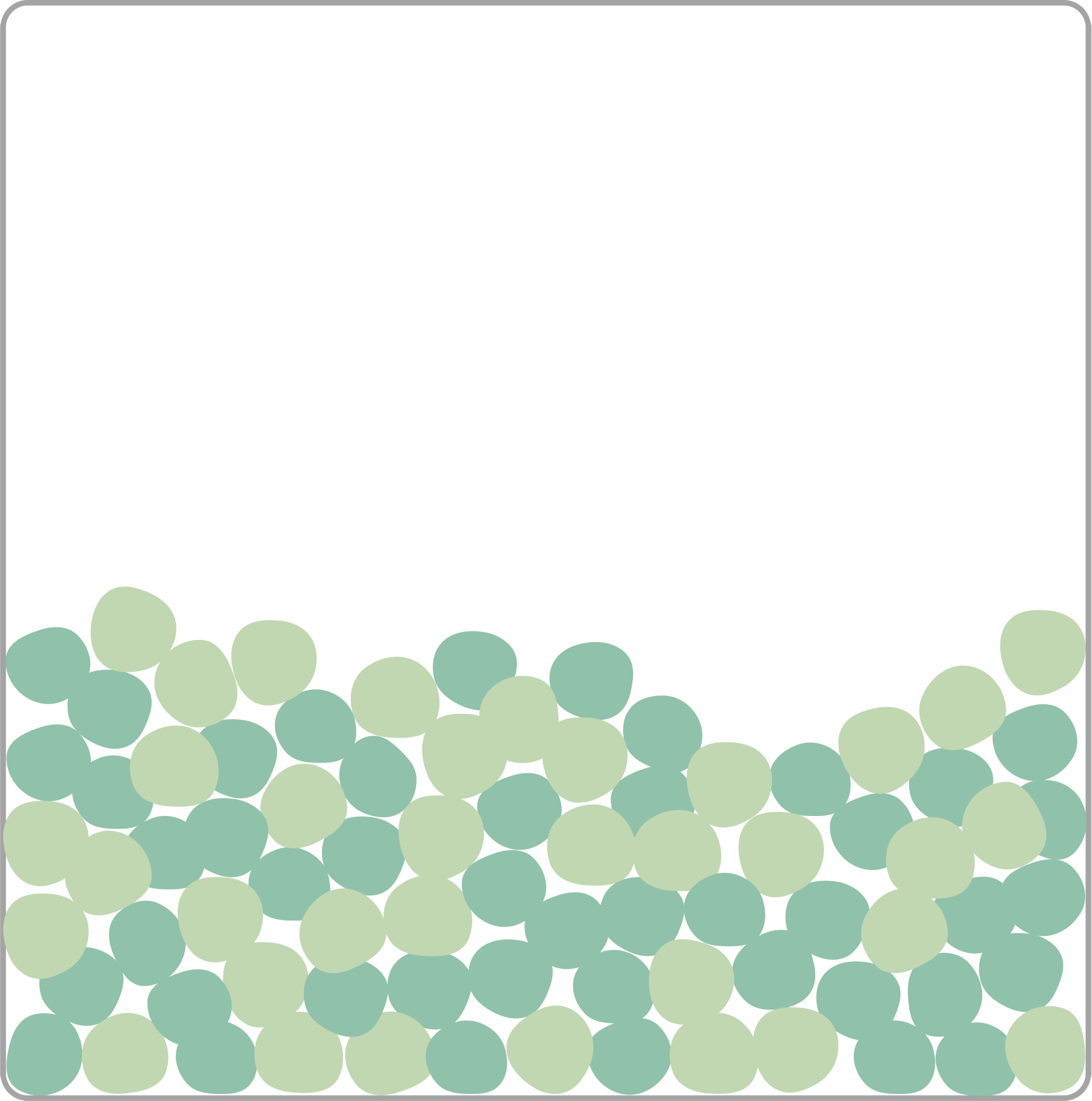
A comment during one of the interviews prompted my decision to make custom graphics for this project. The interviewee responded to the amorphous shapes on the landing page, which were inspired by the thermal pools I visited in Yellowstone National Park. She felt that the softer, irregular, smooth, edges were more inviting than the app she previously used. She mentioned that the square blocks of the calendar tracker, and even the perfect circles marking achievement in the calendar both felt too rigid and “jarring”. There was something in that visual reaction that sparked my desire to create a softer design overall, something that was not rigid, that allowed for flexibility and supported the strategy of the app to retain active users and encourage them to return after a lapse.
Wireframes
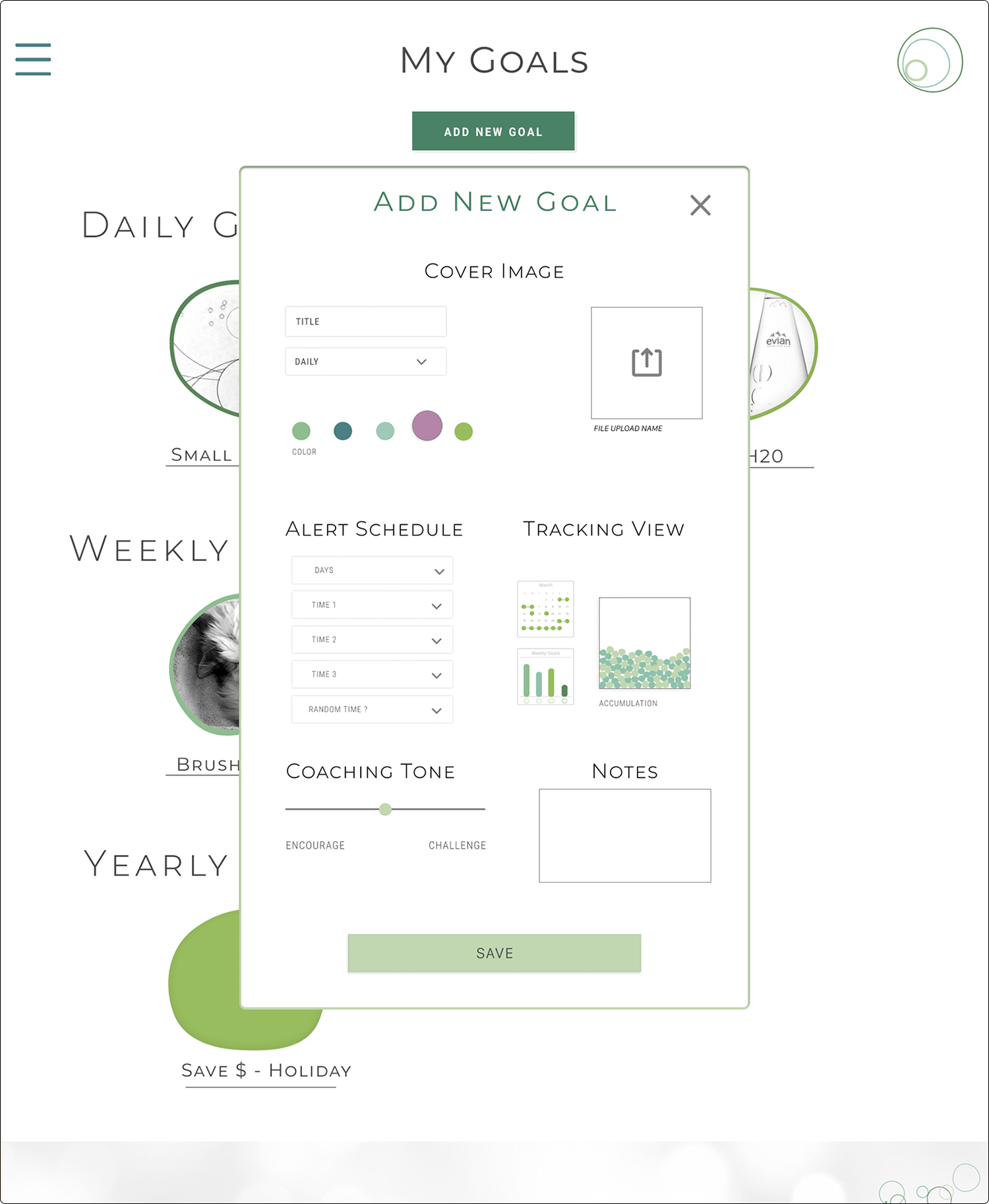
The user begins with a sign-in on the landing page and is placed on the “My Goals” page. On this page, they are able to view all their goals categorized in daily, monthly, and yearly sections. The user then adds a new goal, selecting their title, image, alert schedule, coaching tone, and tracking view. After the new goal is saved it appears in the correct category on the “My Goals” page. The mobile design is constructed to mimic an app experience using the option for Face ID and a floating bottom bar containing the same icons as the desktop version. During interviews, most participants said they would access via their mobile device, which was an integral element of the design decisions.
A familiar upload image prompt allows the user to upload an image from their phone library or via their camera. A personalized visual reference increases engagement from the user and is easily recognizable on their profile/goals screen. These image-based goals are listed on the widget for easy access and check-in link.
Access to the profile link, via the person icon on the bottom bar, allows users to sign in without navigating past the landing screen. Face ID is also an option to quickly sign in. Increasing efficiency supports the user’s desire for a simplified experience.
Once the user is signed in they are directed to their goals screen. At this point, the user can add a new goal easily via the “+” icon. The following screen “Add Goal” contains several highly customizable choices. These personalized settings support user engagement
A familiar upload image prompt allows the user to upload an image from their phone library or via their camera. A personalized visual reference increases engagement from the user and is easily recognizable on their profile/goals screen. These image-based goals are listed on the widget for easy access and check-in link.
A familiar upload image prompt allows the user to upload an image from their phone library or via their camera. A personalized visual reference increases engagement from the user and is easily recognizable on their profile/goals screen. These image-based goals are listed on the widget for easy access and check-in link.
A familiar upload image prompt allows the user to upload an image from their phone library or via their camera. A personalized visual reference increases engagement from the user and is easily recognizable on their profile/goals screen. These image-based goals are listed on the widget for easy access and check-in link.
A familiar upload image prompt allows the user to upload an image from their phone library or via their camera. A personalized visual reference increases engagement from the user and is easily recognizable on their profile/goals screen. These image-based goals are listed on the widget for easy access and check-in link.
Mobile & Desktop
Mid-Fi, Prototype Testing
Wireframes
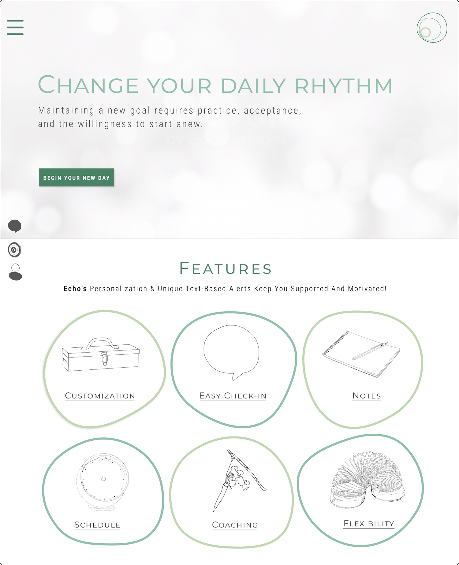
I created custom icons to reinforce the branding. However, initial testing revealed users gravitate toward the CTA in the hero section, not the floating icons. To improve accessibility, and readability, I changed the color of the floating icons, slightly increased the size, and moved placement up several pixels, to create more contrast .
To further reduce the depth of the design I added a zoom feature to replace the need to click to another page. The zoomed bubble activates on a hover and contains the detailed information for each feature.
Discuss use of video as meditative feature.
